Two-Colour Jewellery and Your Skin Tone: Which Metal Leads
Two colours still make you choose
In a two-colour ring the leader is not the metal that covers more surface. A thin strip of polished gold overrides a wide matte steel band: its highlight is strong, and the steel's larger share has nothing to back it up. So a piece chosen for its calm steel half photographs gold. That is arithmetic, not a flaw.
A two-colour piece is often bought as a way out of choosing. The logic is easy to follow: if a ring carries both yellow and white gold, it will suit any box and any sleeve. The logic is right by half. The piece will indeed sit beside anything, but on you it will look the way its leading metal looks, and that is a separate question from what it goes with.
Wear the symbol, don't just read about it. These are in stock:
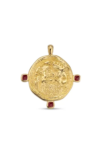
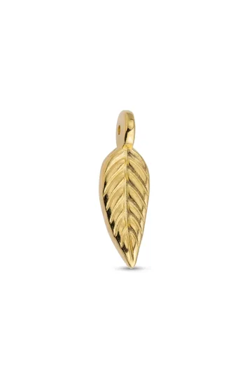
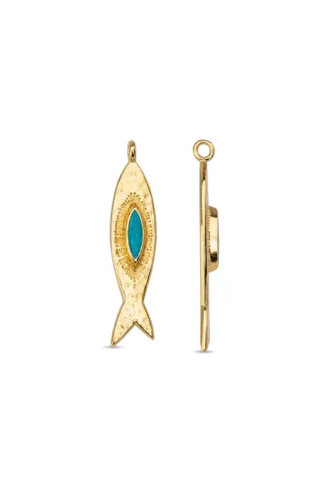
This guide is about naming the leader on purpose. The share of the areas, the gloss of each half, the character of the line between them, the kind of piece, and what already lies in your box. All of it is settled before the purchase and hardly at all after.
Two metals, and still only one leads
The leader is named by three quantities: the share of the area, the gloss of the surface, and the gap in lightness between a metal and whatever sits next to it. They multiply rather than add, so one large quantity overrides two small ones. That is where the feeling comes from that a piece behaves unlike the window promised.
You can see the result in a second. Squint at the piece: the detail drops out and what stays is patches of different brightness. The metal that remains visible through the squint is the leader. The trick is coarse, and it works in poor light and asks for nothing but your eyes.
The guide uses two tools, and it is worth not confusing them, because they answer different questions. The squint measures: it compares the brightness of the halves against each other and against your skin, and it tells you who is leading right now. The turn switches: it changes not the make-up of the piece but which part of it faces up and catches the light, and it tells you whether the other half can be made to lead. One tool reads the state of play, the other shifts it.
Choosing a two-colour piece, you choose not "both metals" but one leader and one support. From there the matter turns on your skin, your hair, and the light you live under.
What this guide answers, and what its neighbours do
The line is worth drawing at once, so you do not look here for what is not here. The broader question of a golden versus a silvery cast, the ways of reading your undertone, how a single metal behaves under different light, and the seasonal colour system all sit in a separate guide on metal and skin. It closes that question in full. Here the conversation begins where the choice of one cast is already made for you: the piece holds both metals at once, and all that is left is to decide which of them comes forward.
How two-colour pieces are built, how a solder join differs from cladding, and which metal pairs exist in finished goods are set out in the guide to bimetallic jewellery. The make-up and behaviour of the alloys themselves are unpacked in the guide to the colours of gold. Rules for how much of each metal to wear across different pieces at once, rather than inside one piece, sit in the note on mixing metals; the figures for those two tasks look alike and do not carry over.
What happens between the metal and the skin
Three parties take part in a two-colour piece: the two halves and the skin beneath them. Each shapes how the other two are seen, and this is measurable optics, not a metaphor.
Skin is a background that scatters light
Skin gathers its colour from several sources: melanin gives the brown, haemoglobin the red, carotenoids the yellowish note. A different property of it matters more to us. The upper layers are part-transparent and scatter light, so skin returns it in all directions at once, an even patch with no bright point.
For a two-colour piece the consequence is central. A metal and the skin differ both in lightness and in the character of the reflection: the skin scatters, a polished metal throws light in one direction, with that single point of highlight. So a polished half separates from the hand more sharply than a matte one of the same lightness, and the matte one sits closer to a patch of skin and slips into the background. That is why gloss carries weight in the rule of this guide: it changes both the brightness of a half and the very kind of its reflection, and its values run wide.
A second consequence is about the surroundings. Skin is rarely the only background: beside it are a sleeve, a collar, hair, a watch strap, a neighbouring piece. Each stretch sets its own lightness, and with it the balance of forces shifts. On light skin the larger gap falls to the warm, darker half; against a dark cuff the light half comes forward, because now it is the one furthest from the background. Judge the background by what actually surrounds the piece on you, not by a clean hand from a catalogue.
Why gold is yellow and silver is white
The physics here is short and handsome. Metals reflect light with their electrons, and in many of them that reflection is even across the whole visible range, which makes the metal look white or grey. Gold absorbs the blue part of the spectrum and reflects the yellow and red. The reason is that the gold atom is heavy, its electrons move at near-light speeds, and this shifts the energy levels just enough for the absorption band to land in the visible blue. In silver, which is lighter, the same band lies in the ultraviolet, and the whole of the visible light reaches the eye.
The upshot shows on any two-colour piece. Silver reflects visible light better than any other metal, near ninety-five per cent. Steel and rhodium-plated white gold reflect noticeably less. So the "cool half" is not one material but a range with different brightnesses, and which one is used decides the balance of forces in the piece.
Two metals recolour each other
This is worth knowing before you try a piece on, or the result will look like chance. Early in the nineteenth century the chemist Michel Eugène Chevreul ran the dye works of the Parisian tapestry manufactory and looked into complaints about black wool: buyers said the black came out dull. The dye was sound. The neighbouring threads were the culprit: next to certain colours the same black read differently.
Out of that enquiry grew the law of simultaneous contrast, published in 1839. The statement is plain: the colour of a thing depends on what lies beside it, because the eye compares rather than measures. A two-colour piece is a copybook case of the law. The yellow half looks warmer beside the cool one than it does alone, and the white one beside the yellow reads bluer than it is.
Hence a nuisance for anyone choosing from a catalogue. Judging the metal of a two-colour piece from a shot of one half alone is useless: in the assembled piece both shades shift, each in its own direction. You can only judge the whole piece, and only on the skin.
Contrast matters more than temperature
The argument over warm and cool masks a stronger factor: the difference in lightness. The eye reacts to a jump in brightness before it reacts to a hue. A metal clearly lighter than your skin is seen from across a room and draws the eye to itself. A metal close to the skin in lightness reads as a continuation of the body and works quietly.
For a two-colour piece a working logic grows out of this. Want a visible accent, and you make the leader the metal with the larger lightness gap against your skin. Want an everyday piece, and you make the leader the one close to the skin in brightness, and leave the second as a line.
The measure is handy for one more reason: it is honest. Lightness is compared by eye in a second, it shows in a photograph, and it asks you to believe no one's classification of people.
People bring me a two-colour ring and say it has gone dull. The ring is fine. Three silver pieces simply joined it in the box, and the gold half ended up outvoted. The fault is not the piece but the company it keeps.
A stylist's read: fitting two colours to yourself
The share of the halves and the character of the border are set at the bench before the piece ever reaches a window, and after the purchase neither can be replayed. The finish holds far more loosely: a bench turns a matte face polished, or the reverse, in one sitting. And everything around the piece is yours entirely: the neighbours on the same hand, the zone you wear it in, the metal of a stone's setting, the number of expressive borders on one part of the body. Those are the levers a Zevira stylist reaches for first, both when choosing a two-colour piece and when rescuing one already bought.
A two-colour piece has fallen out of favour and I would rather not replace it. What do you suggest?
I change the company, not the piece. I take the neighbours in the leader's metal off that same hand and add one in the supporting metal. The balance of forces flips, and the piece reads afresh. It costs nothing and works faster than any purchase.
How many two-colour pieces can be worn at once?
One per zone. Two of them on one hand start to argue: each has its own border, and the eye finds nowhere to rest. If a second is a must, I split them across zones, a ring on the hand and earrings by the face, and I keep the leading metal the same on both.
How do you put a two-colour piece together with a stone and not make a jumble?
The stone's setting has to echo one of the two metals, never bring in a third. That is the single hard rule I hold to. After that I give the stone the dark or matte half as a backdrop, so it reads brighter and the piece does not scatter into parts.
What do you advise a couple who want matching two-colour pieces?
One metal pair for the two of them, different shares. Mirror copies look like a uniform, but when the warm half leads for one and the cool half for the other on the same pairing, the link reads and does not look issued from a kit. I split the widths too, and that saves more couples than any engraving.
On a shoot the light is set by other people. How do you choose a two-colour piece for that?
I pick a piece with a large lightness gap between the halves and a sharp border. A fine line and a soft blend vanish in the first frame on set, whatever the catalogue promised. Under someone else's light, what carries is always what is visible from five paces.

Turn on your camera, pick earrings, a pendant or a ring, and see the piece on yourself in real time.
Switch items in one tap.
Everything runs in your browser: no photo or video is ever uploaded.
Trying on a two-colour piece in particular
The general ways of reading an undertone, the vein test, the white cloth, and the comparison of two samples are set out at length in the neighbouring guide, and there is no need to repeat them here. A two-colour piece is tried on differently, and the difference is larger than it seems.
Why the undertone test misleads more here
Any method of matching one cast is built as a comparison: a warm sample against a cool one. In a two-colour piece both samples lie in one object and enter the field of view together, so there is nothing left to compare against. The eye is handed a ready pair and rates it as a whole.
The law of simultaneous contrast piles on: the halves tint each other, and you see neither the yellow nor the white you would have seen apart. Hence the familiar scene at a display. A person who read their cast confidently on single-colour pieces picks up a two-colour one and stalls, because the old method has stopped giving an answer.
The undertone has not gone anywhere. A two-colour piece simply needs a different set of actions, and it is below.
The turn: which half ends up on top
Put the piece on and turn it so one half faces up, look, then turn it to the other. On a pendant that is a turn on the chain; on a bracelet, a change of side on the wrist. On a ring it depends on how the border runs: a band divided across into sectors turns and swaps its leader, while a band with the border running around it shows both stripes at all times, and turning it is pointless.
What works here is the orientation to the light. The half against the body is seen by neither you nor the person opposite; what is seen is the half facing up, catching light from a window and throwing a highlight, while the half gone to the side loses its shine. The turn changes not the make-up of the piece but its leader, and it does so for nothing.
The tool has two limits, and both are worth holding in mind. The first is geometric, named above: the turn swaps the halves only where they truly change places, which is the sector border of a ring, the pendant, and the bracelet. The second is about the skin: the turn says nothing about it, because the contact of metal with the body plays no part in it; what plays a part is the angle to the light source. The question "how does this half sit on my tone" is answered by the squint; the question "can I bring the other half forward" is answered by the turn. Two different actions, two different answers.
Out of the tool comes a buying decision. If one orientation is plainly the one you like, choose a model where the metal you want is built onto the outer, upward-facing side. In pendants and earrings that split is sometimes set by the maker, and it shows in the description.
Look at the border, not the middle
The usual fitting mistake is to study the large half. Yet what sets a two-colour piece apart from a single-colour one is the border, and it is by the border that the eye opposite reads the piece.
Check it at three distances in a row; it takes half a minute. Up close, at a palm's length, the neatness of the join and the finish show. At arm's length it becomes clear whether the two colours read at all. From five paces only a patch of brightness is left, and there the true leader comes out.
A piece is a success if it makes sense at all three distances. Sometimes a piece is lovely up close and turns into a vague grey ring at five paces, and then the catalogue holds a neighbouring model with a wider second half worth taking instead.
Three faults that show up only in a photo
Photograph a hand or a neck with the piece by a window, without flash and without editing, and look at the shot the next day. Three things surface exactly this way, and never surface in a mirror.
First: the second metal turned out too small. In a mirror you know it is there and fill the picture in for yourself. In a shot the thin line disappears, and the piece reads as one colour you overpaid for.
Second: the finish argues with the skin. A mirror polish on light skin in bright light gives a white blot instead of a piece, and a deep matte surface on dark skin is lost altogether.
Third: the leader turned out to be a metal other than the one you counted on. This is not a fault and not a maker's error but a result of that same product of three quantities, and it is cured by changing one of them.
The border between the metals: the main line of the piece
Everyone talks about the proportion, almost no one about the character of the border. Yet it is the border that decides whether a piece looks severe, soft or restless, and it is the border that decides whether the two colours survive to the distance of a conversation.
The sharp joint
A straight meeting of two metals with no transition. The most legible option: it is seen at any distance until the width of both halves has thinned to a hair. A sharp line lends the piece a drawn, geometric feel and works like a blueprint.
On the skin it looks definite and a touch severe. If the skin has texture or a patchy tan, a sharp border underlines that unevenness, because beside a perfectly straight line any accident is more noticeable. On smooth skin the effect reverses, and the piece looks clean.
The demand on quality is highest here: any step or gap at the join shows at once. Run a nail across the border, and the surface should feel continuous.
The soft blend
A gradient from one metal to another turns up in pieces with a deposited coating and in some joining techniques. The two colours stay visible up close and dissolve at a distance: about three paces out the piece reads as one colour that has taken on an in-between shade.
A gradient has no line along which the eye catches the quality of the work, so such a piece is judged another way: by the evenness of the blend itself, the absence of blotches and streaks. It is a considered, sound choice for anyone who wears a piece where it is seen up close, over a table or face to face in talk.
The divider line and the groove

Between two metals a third element is set: a narrow groove, a dark oxidised furrow, or a thin strip of another colour. The device is old and very practical. The divider quiets the mutual pull of the halves described above, and each metal begins to read closer to its own colour.
Anyone who likes both halves apart but finds them muddy together should look at exactly these models. On top of that the groove forgives an imperfect join, because the eye takes it for intent rather than a defect.
The device has one limit: the divider adds fragmentation to a piece. On a narrow band three lines instead of one begin to fret, so a groove belongs where the band is wide enough that it does not eat half the design.
The twisted and alternating border
A twist of two wires and an alternation of links give not a line but a rhythm. Up close this is the most engaging of the borders: it is alive, plays on the turn, and shifts with the angle of view.
Then the arithmetic of distance begins. A fine pitch of twist merges into one averaged tone at arm's length, and the piece loses its two colours entirely. A coarse pitch holds on longer. The finer the rhythm, the closer the distance at which the piece works, and the more it matters to wear it where it is seen up close.
Customer reviews
Zevira is a real jewellery shop. Genuine payments, deliveries and customer thank-yous.
🥰🥰🥰 gracias
Ok, ¡gracias! 🙂
Which metal leads in the pair
Which metal pairs turn up in finished pieces is listed in the guide to bimetallic jewellery. Here the question is different, and it is the only one: by what sign is the leader named in a given piece.
The rule of three factors
The leader is set by the product of three quantities: the share of the area, the gloss of the surface, and the lightness gap against the background. The background is your skin, and inside the piece it is the second half as well.
The factors multiply, so a large value of one overrides small values of the other two. This is the single rule in the guide, and every apparent contradiction about "a tenth of the area" or "half the area" is settled by it: the share decides the outcome only when the other two factors are roughly level between the halves.
The factors have no seniority; they have values. In the product all three are equal, and the one whose quantity is the larger in a given piece comes forward, not the one that ranks higher on a list. The sense that the share of the area is the weaker of the three comes from practice, not from the formula: in finished pieces the share wanders between about a tenth and a half, that is, by a factor of a few, whereas the gap between a mirror polish and a deep matte, or between a light metal and a dark oxidised half, runs far wider. The range differs across the factors; the weight is the same.
The practical sense is direct. Rating a piece, do not hunt for the main sign; compare the halves across all three and see where the gap is largest. There the leader is set, and there too lies the lever if the result does not suit you.
When area decides
The most common and calmest case: both halves are close in gloss and in lightness. This happens when two light metals with the same finish are taken, say a light yellow gold and a rhodium-plated white.
Here the leader becomes the one with the larger share, and plain arithmetic works. A third of the area already reads as a full second half. A tenth of the area is lost in such a layout: with no backing from gloss or brightness it is seen up close and vanishes at arm's length.
When gloss decides
A polished surface reflects in one direction and throws a highlight; a matte one scatters the light and gives none. So a polished half comes forward of a matte one of the same colour, even taking up less room.
The extreme case of this rule: a narrow polished inlay on a wide matte field becomes the leader at a tenth of the area. That is exactly why one and the same tenth of the area will disappoint you in one piece and turn out to be the most visible thing in another. The difference is not in the share but in whether that share got the shine.
When the lightness gap decides
This factor takes its largest values where the halves differ in the brightness of their reflection: silver against steel, a light metal against an oxidised or dark coating. Here the area helps little; the dark half slips into the background at almost any share, and the light one leads.
A second background is your skin, and it moves the balance on its own. On dark skin the warm half is closer in lightness and goes into shadow, and the light one steps forward. On light skin the picture reverses. Check it by squinting: put the piece on, step a couple of paces from the mirror and squint. The half left as a separate patch leads, the one merged with the hand does support work. Worth seeing before the purchase, not after.
What to do when the leader is not the one you wanted
There are exactly three levers, one per factor, and they differ sharply in price. Cheapest of all is the surroundings, and it is also the fastest: neighbouring pieces change the background against which the lightness gap works, and one ring in the metal of the supporting half turns the whole picture on the hand around, costing nothing and asking for no bench and no new purchase.
The second lever by price is gloss. The same metal pair with one half matted gives a different leader with no change of make-up, and such models sit next to the ordinary ones in a catalogue; a piece already bought is matted or polished at a jeweller in one sitting. The third and dearest is the share of the areas: inside a finished piece it cannot be redone at all, and there all that remains is to seek a neighbouring model with a wider second half. Worth remembering in that order, because intuition suggests the reverse: people first go to change the piece and only then think to rearrange what is already lying in the box.
Upload a photo of your pet, someone you love, or an object. We'll build a 3D model and hand-cast it in pewter.



Proportion: how much warm metal you need
The ratios below are about the shares inside one piece. Do not mix them up with the rules for combining different pieces worn together: there the talk is of objects, here of halves, and the figures do not carry over.
Half and half: contrast as the plan
Equal shares give the most legible pair of colours when the gloss and lightness of the halves are close. The piece announces itself at first glance and does not pretend to be one colour. The eye travels along the border, and the border becomes the main line of the object.
The choice is good when the piece is the only one on a hand or a neck and has to hold attention on its own. It is bad when a watch, a second ring and a bracelet already sit alongside: three borders in one zone turn into fretting. One expressive border per part of the body is enough.
Seventy to thirty: leader and accent
The most versatile ratio and the hardest to spoil. One metal holds the piece, the second appears as a detail. This is where two colours do the very thing they were invented for: the piece lives calmly with both warm and cool things in the box, and does not argue with the skin.
The choice of leader in this ratio is the whole question of the guide. The leader is made the metal that, at a squint, stays a separate patch on your skin, while the second takes on the role of a link to the rest of your pieces.
A thin line of the second metal
A ratio of about nine to one gives a near single-colour piece with a hint. The fate of that line hangs on gloss: polished, it overrides the matte field and stays visible; matte on matte, it disappears already at arm's length.
Here too lies the catalogue trap. On a macro shot a thin line takes up a much larger part of the frame than it does on a live hand at an ordinary distance. Buying a piece for its two colours, take a model with a wider second half. Buying it for the form, with the second metal wanted only as a link, nine to one is exactly right.
The distance where a piece reads as one colour
There is no threshold in millimetres, because it is made of those same three factors and of the distance to the viewer. Yet it is easy to find by feel, and worth finding in the shop.
The method is this. Put the piece on and step away from the mirror, marking the pace at which the two colours vanish. A sharp border of light and dark holds longest, a twisted pair of metals close in brightness gives way first, a soft gradient somewhere between.
The rest is your call. For a piece that lives on a hand at a desk, a threshold of two paces is enough. For a piece that should be noticed across a room, you want a pair with a large lightness gap and a sharper border.
Finish changes the visible colour more than composition
The make-up of an alloy sets the colour of a metal once and for good. The finish sets how much of that colour returns to your eye, and it is redone at a bench in one sitting. Of the two levers the second is both stronger and more within reach.
Polish, matte, brushing
A polished surface works like a mirror: it reflects the surroundings more than the metal's own colour. So polished gold by a window looks cooler than it is, and under a yellow lamp warmer. The highlight gives the greatest brightness and the greatest contrast with the skin.
A matte surface scatters the light in all directions. The metal reads lighter in average tone but duller, without flashes. Brushing, that is directed strokes, sits between: a highlight is there but smeared into a line and does not strike the eye.
Different finishes on the two halves as a tool
Here the finish stops being cosmetics and becomes an instrument for naming the leader, the very thing the rule of three factors spoke of.
The device solves two frequent troubles. A piece looks flat, which means the halves are alike in texture, and a model is wanted where one of them is matted. The leader turned out to be the wrong metal, which means the shine went to the wrong half, and the same pair with the finish reversed gives the result you want without a change of make-up.
The shift shows most clearly in a matte steel paired with a polished gold: the narrow gold line leads with confidence there, though it has almost no area. The reverse layout of finish on the same pair flips the result too: a polished steel thread on matte gold brings the cool half forward, and a buyer who chose the piece for its warm field gets a silvery accent. The metal pair is one and the same in both cases; only who got the highlight differs.
The dark half: oxidation, plating and niello
The third colour that turns up in two-colour pieces alongside white is black. The pair of black and gold spreads the halves in lightness further than any pair of two light metals: there the gap runs between shades of one order of brightness, here between a glow and a void. The light half leads in such a pair at any reasonable share, because the dark one simply slips into the background.
The dark is got in three different ways, and in product descriptions they are often called by one word, so a buyer expects behaviour the piece does not have. Oxidation is silver sulphide right on the surface of the metal: the piece is held in a liver-of-sulphur bath, the layer forms in minutes and lasts exactly as long as the surface is whole. Plating is a separate thin layer, laid down in vacuum over the finished piece. Niello, true black, is not a coating at all: an alloy of silver, copper and lead with sulphur is melted and run into the engraved lines of a design, then polished flush with the metal.
For the rule of three factors all three give the same thing, a very dark patch with little reflectance. But they age differently, and that is worth knowing before the purchase. A surface layer goes first on the ridges and raised places, so the dark half lightens in patches and the gap melts away. Fused niello sits in the recess and holds as long as the design itself is whole, which is why old pieces with niello reach us with a legible pattern. How coloured and dark deposited coatings behave is unpacked in the note on PVD coating.
On the skin the dark pair works hard and noticeably, so it is worth trying on with particular care. On light skin the black half looks like a void and reads heavily. On dark skin the gap between piece and body is smaller, and the piece sits more calmly.
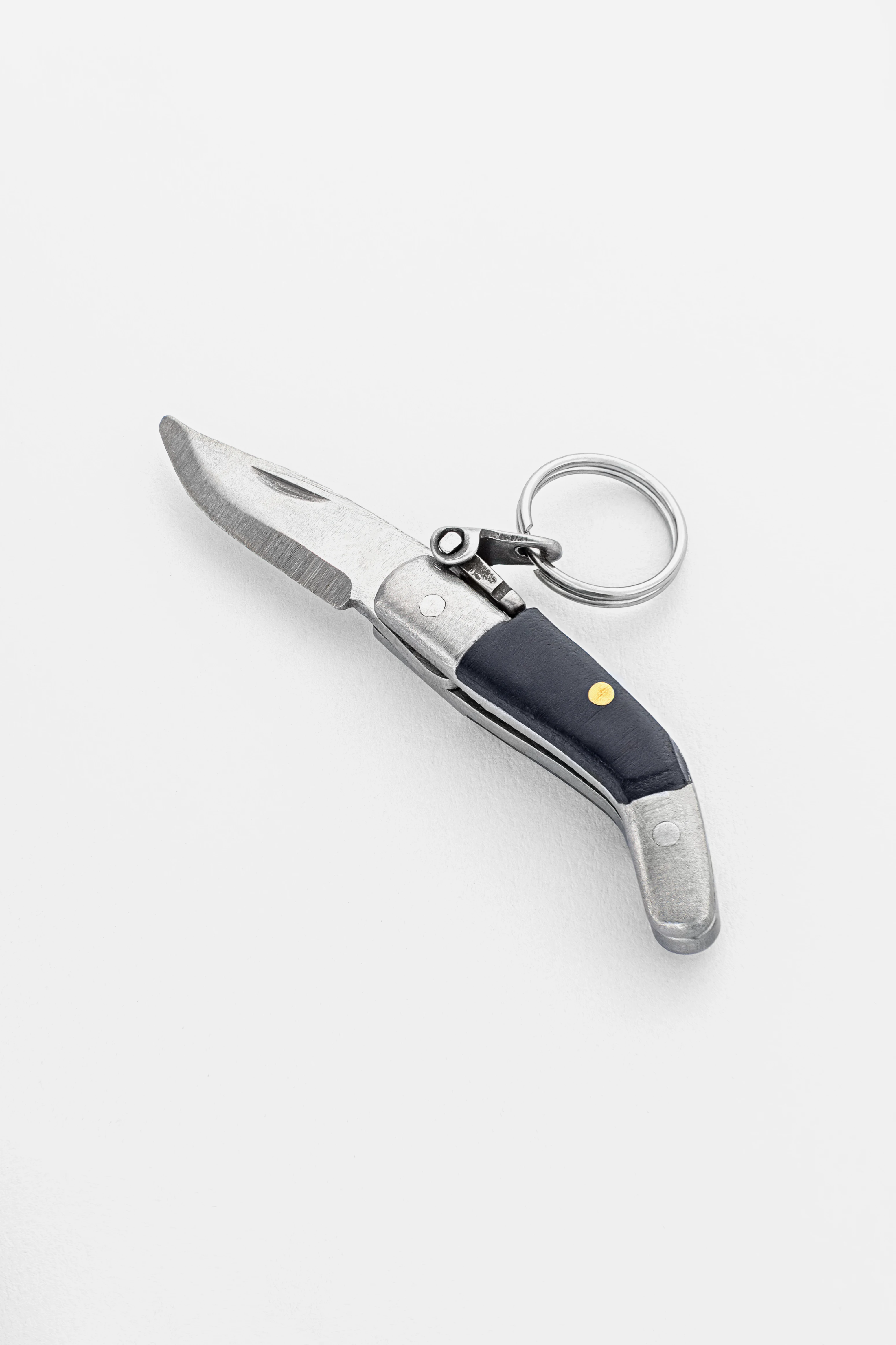
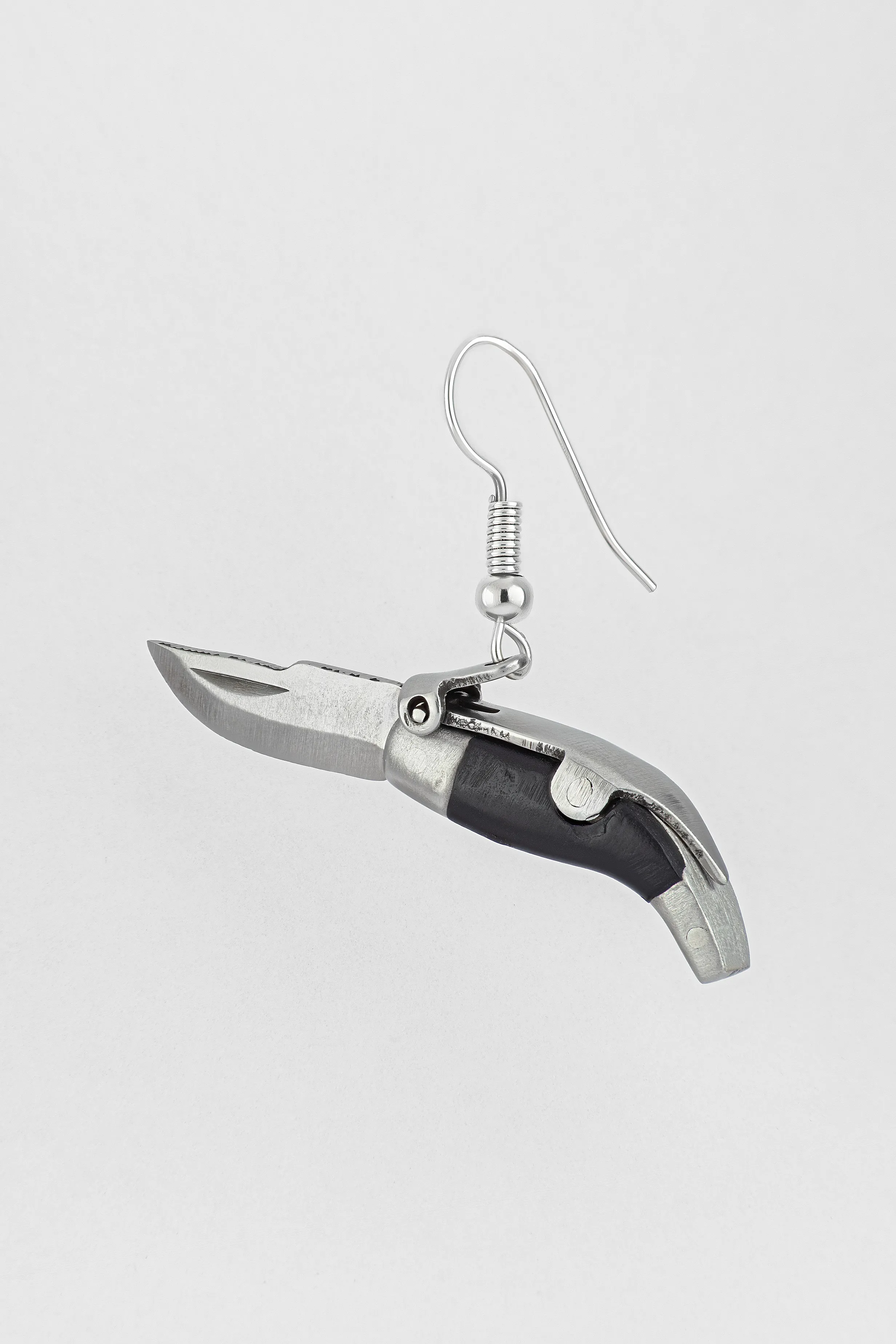
CAPAORA mini knife pendant
The 18th-century Spanish navaja in miniature: 40 mm of stainless steel, a real folding mechanism and a Palanquilla lock that clicks. An affordable gift to remember.
Authentic · Ships from Spain · 14-day returns
Two colours across different pieces
One and the same idea on a ring, a chain and a pair of earrings behaves differently, because the distance of viewing and the texture of the skin beneath the piece differ.
A ring: border across or around
On a ring the border runs either around the circumference, splitting the band into an outer and an inner stripe, or across, splitting it into sectors. The first is seen at all times and works as the main design. The second appears and vanishes as the hand turns, which makes the piece feel livelier and its two colours less reliable.
The background under a ring is markedly busier than beside the face, and it shows with no theory at all. The hand carries its own pattern: creases, knuckles, tendons, veins. Hands are also open to the sun more often than other stretches, so the back of the hand tends to be darker than the face and comes to winter and summer in different tones. Fine detail is lost in such texture, so a ring wants a coarser step of design and a sharper border. A thin twisted pair of two metals close in brightness merges on the hand already at arm's length.
A chain and a pendant: what is seen beside the face
At the throat the metal enters the field of view together with the face, so its highlight reaches the person opposite alongside your features. This is a matter of how a frame is composed, not of physiology: the skin makes no answer to reflected light; the answer is made by the eye of the one looking.
Hence the difference between throat and wrist that everyone notices, wearing one piece in the two places. On the wrist a piece enters the field of view on its own, from above and up close, and is rated by itself. At the throat it always comes paired with the face, and the half that throws a highlight competes for attention with the eyes of the person opposite. The object is the same, the neighbourhood different, so the decision is different too.
For a pendant a concrete rule of choice follows: the half you want seen in the frame of a conversation goes up, toward the face, and the other slides to the lower and outer edge. On a chain the same is got by alternation, where the wanted links fall on the visible side of the weave. The tone of your skin does not touch this arrangement, because it is decided not by the skin but by what falls into one glance with the face.
Earrings: why the lower end reads longest
An earring hangs and turns, so the share of the areas works worse in it than in a ring: the halves keep swapping places against the gaze. One thing stays steady, the position on the vertical.
Hence a split of roles, and it fits the same rule of three factors, only the lightness gap is reckoned here against a different background. The upper part sits on the lobe, its background is skin, the gap is small, and it works quietly. The lower one hangs against hair, a collar or whatever is behind them, where the gap is usually larger, and it holds in the field of view of the person opposite longest of all. There is no fourth decider here; there is one and the same factor, reckoned twice.
The practical takeaway is simple. In a long earring the metal you want leading goes to the bottom, and the lobe takes the supporting half. Having split the two roles, you will stop arguing with yourself at the mirror.
A bracelet and a watch: two colours for the wearer
The wrist is arranged so that a piece on it is seen by its own owner rather than by those around. Hence a licence: here a fine rhythm of the border and thin lines of the second metal are taken, the ones that would be lost on a ring.
The second difference is practical. A bracelet and a ring on one hand form a pair, and if their leaders are different metals the hand looks unassembled. A two-colour bracelet next to a single-colour ring cures that trouble on its own, when its leader matches the metal of the ring and the second picks up what is worn on the other hand or at the neck.
Leave your email, we'll send your discount code. No spam, unsubscribe anytime.
The code arrives by email, valid on your first order.
Skin shifts, and that is fine
Everything set out above holds for this evening. Part of the conclusions will need revisiting the moment the skin, the light around, or the company in the box shifts, and for a two-colour piece such changes are no threat but its main advantage.
A tan changes the leader, not the piece
After the sun the skin darkens, and without the sun it rolls back to the earlier tone. For our task one outcome of that swing matters: the lightness gap between the skin and the light half has grown, and the one between the skin and the warm half has shrunk.
A single-colour piece under such a shift either stops working or starts. A two-colour one simply changes its leader: on darkened skin the cool half comes forward, on lightened skin the warm one. Nothing needs buying afresh; it is enough to understand what has happened.
Anyone who changes a great deal in the sun finds it easier to keep the share nearer to even. It rides out both states of the skin, while nine to one works well only in one of them.
Grey hair widens the gap for the warm half
A light, cool background by the face changes the terms for a piece worn above. The lightness gap between such a background and the warm half grows, which means the warm part becomes more noticeable than it was under the same piece before.
No ban follows from this, only arithmetic. Want it quieter, take a piece with a smaller share of the warm metal or with that half matted. Want it brighter, leave it as it is and be glad the piece has begun working harder with no effort on your part.
A seasonal look: what exactly to review
Once in a few months a two-colour piece is worth a fresh look, and it takes five minutes. Three things are checked, and none of them is about taste.
First: whether the leader has shifted. The share of the areas could not have changed, but the lightness gap against the skin could, and a squint at the mirror shows it in a second. Second: whether the finish is intact. Polish dulls, a matte surface burnishes under friction, and the shine moves from half to half of its own accord. Third: whether the company in the box has changed. Three new pieces in one metal can reassign the leader more surely than any tan.
Light and the contrast between the halves
How a single metal behaves under different light is unpacked in the guide to metal and skin. For a two-colour piece the question stands differently: light changes not so much the metals themselves as the distance between them.
Warm light squeezes the gap between metals
Under warm light, whether an incandescent bulb or a warm diode, both halves take a yellow lean at once. The gold grows richer, and the white metals move off their own whiteness toward it.
For a two-colour piece this means a squeeze of contrast, sometimes almost to nothing. A piece that read as two colours by day looks one colour over dinner. There is no defect here, but a piece for evening occasions is worth choosing with a margin: the same pair, but with a sharper border and a larger difference in brightness.
Cool light flips the leader
Cool light works the other way: the white metals win in brightness, and the leader becomes the white half, even where the warm one led by a window during the day. It is not the piece that changed but the source.
The takeaway is plain and it is about where you try a piece on. A piece named leader by a window will show a different leader in a room under ceiling lamps, and seeing this is better done before the purchase. It is enough to step with the piece into the depth of the hall, ten paces off, and look again.
Why two white metals part ways outdoors
Metamerism is the case where two samples match in colour under one light and part under another. Inside a two-colour piece it does not happen: the yellow and white halves match under no light at all; between them there is simply a distance the lighting makes larger or smaller.
Between different pieces, though, metamerism works splendidly. The white gold of one piece and the steel of another meet under a shop lamp and part outdoors, because their reflection curves differ in shape, not in height alone. So a new two-colour piece is compared with what you already wear under two light sources in a row, and it is done before the till.
Caring for a two-colour piece
A two-colour piece ages unevenly, because two different materials age at different rates. Worth knowing before the purchase, not after the first cleaning.
Why rhodium on the white part wears unevenly
White gold is not white in itself. An alloy of gold with palladium, silver or nickel gives a greyish-yellow metal, and it is brought to the wanted whiteness with a thin layer of rhodium, a metal of the platinum group. It is rhodium that gives the cool mirror.
That layer is thin and goes under friction, first on the raised places: the ridges of the band, the corners of facets, the clasps. In a two-colour piece the consequence is double. The white half begins to warm in patches, the gap between the halves melts away, and the piece looks tired sooner than it has truly worn. Renewing the coating at a jeweller is routine. Anyone who wants stability of colour with no upkeep should weigh the options in the comparison of white gold and platinum.
Cleaning two metals at once
The rule sounds dull and saves pieces: one product does not clean both halves. Polishing pastes for silver hold a mild abrasive, and their trace on gold stays matte.
The order is this. Warm water with a drop of soap and a soft brush suit a whole two-colour piece of any make-up. Special products are applied half by half, carefully and without crossing the border. With coatings, be it rhodium, gilding or a dark deposit, only the gentle part of this list works: an abrasive paste strips the thin layer, and the white half warms in patches ahead of time, while the dark one lightens on the ridges.
Storage decides no less than cleaning. The silver half darkens from the air faster than the gold one, so after washing the piece is dried with a soft cloth and put away in a closed pouch, apart from the rest. Otherwise the gap between the halves drifts on its own, and one day you take out of the box a piece with a different leader, without ever having had it redone.
Sizing and repair
Resizing a two-colour ring is harder than a single-colour one: the bench has to keep both the shares of the halves and the design of the border, or after the work the proportion drifts and the piece stops being the one you chose. Ask to be shown how the ratio of areas will change before the work begins.
The second sensible question is about experience. Two-colour pieces call for work on two materials at once, with different melting points and different behaviour under heat. Asking about it is fair, and an honest bench will not take offence.
Send a friend a discount code, they save on their first order.
Two colours and what already lies in the box
A frequent reason to buy a two-colour piece has to do not with the skin but with a box where mismatched pieces already lie. Here an object of two metals works not as jewellery but as a tool.
A neutral case does not mean it makes no difference
Skin that lives evenly with both a warm and a cool metal turns up often, and a squint shows such people no difference: both halves hold against the hand alike. This is not a dead end but a signal: if the skin does not vote, the box votes.
The decision is simple. The leader is made the metal you own more of in your other pieces, and then the new object gathers a set instead of arguing with it. If the box holds equal amounts of both, choose by the share: equal halves give a piece its own character, seventy to thirty make it a quiet member of the ensemble.
What share makes the bridge read
A two-colour piece can tie together single-colour pieces of different metals, and here the share stops being a matter of taste. For the tie to work at the distance of a conversation, the second metal must take up no less than a third of the area and lose nothing to the first in gloss.
A thin line is no good for this role: it is seen up close, and at two paces the piece reads as one colour, with nothing to tie. One such object per look is enough; a second starts to argue with the first. How to lay out the pieces themselves across hands and neck is set out in the rules for mixing metals.
When the bridge does not help
There are cases where a two-colour piece does not solve the task, and it is more honest to admit it. The first: the pieces in the box differ not in colour but in finish. Matte steel and mirror gilding will not be reconciled by any bridge, because the argument is about gloss, not about temperature.
The second case: too many objects on one part of the body. A bridge explains two metals and does not explain five pieces on one hand. Here you first take away the excess, then choose the tie.
The third: the pieces differ in scale. A massive signet and a thin chain do not gather into a set because one of them holds both metals. Two colours answer for colour and do not answer for proportion.
Two colours for your tone
Jewellery that gathers a warm and a cool metal into one piece, with a different share of the halves and a different finish. Easier to try on than to choose between.
Facts that surprise
- Rhodium takes its name from the Greek for rose: its salts are a rose red in solution, while the metal that coats white gold is mirror white. Rhodium also runs markedly harder than gold, so the layer on a white half serves the soft alloy as armour and whitens it almost as a by-product.
- Rhodium has no large deposits of its own. It is recovered as a by-product of refining platinum and nickel ores, so the price of whiteness in white gold rides on somebody else's mining.
- Nickel and palladium white alloys whiten in different ways: nickel comes out whiter and harder, palladium greyer and softer. Two white halves from two workshops therefore never quite agree with each other.
- Copper in a rose alloy shifts more than the colour: rose gold of a given fineness is harder than yellow, because copper is stiffer than the silver that sits in yellow alloys.
- Nature mixed two metals into one long before any jeweller did. Electrum is a natural alloy of gold and silver, its colour intermediate and the paler the more silver it holds. The first Lydian coins were struck from electrum in the seventh century BC, so people began counting money in a metal of no fixed colour.
- The word niello comes from the Latin nigellum, "blackish", a diminutive of niger, "black". The craft was named for what the eye sees rather than for what goes into it: the name describes the colour, not the alloy beneath.
- Gilding silver, until the middle of the nineteenth century, went through a mercury amalgam, and the trade maimed the people who practised it. Electrolytic methods patented in the 1840s pushed it out within a few decades.
- In France the name vermeil is protected by law: only high-fineness silver with a gold layer no thinner than a set minimum may be called that, not any gilded silver at all.
Frequently asked questions about two-colour jewellery and skin tone
What should I choose if the two-colour piece is a gift and there is no one to try it on?
Pick something that will not need adjusting later: a pendant, earrings, or a bracelet with length to spare. A ring is the riskiest gift, because you have to guess the size and the leader at once, and a miss on the first drags the second to a bench. Beyond that, let the person's own photographs decide rather than your taste: near the face the same metal tends to repeat, and that is the one that should lead in the gift. A gift also has a longer path to its first wearing, so ask in advance whether the white or dark half is alloy or coating, and whether the piece can be exchanged. Detail on combining different objects together sits in the note on mixing metals.
How can I tell from a product listing which metal will lead?
Three things, and all three are usually on the page. The finish of each half, because polished comes forward of matte in the same colour. The width of the second metal in millimetres, not how it looks on a macro shot where a line fills half the frame. And the character of the border, because a groove or a sharp joint hold two colours further out than a twist or a soft blend. A shot taken on a hand, and not only on a white ground, is worth every description at once.
The listing says "coating", not an alloy. Is such a two-colour piece worth buying?
Yes, if you understand that you are buying the life of a surface, not a composition. The words are honest enough: "plating", "gold wash", PVD mean a layer over a base, while a stated fineness of gold, "sterling silver" and "steel" name the material of the half itself. How often the piece sits on you settles the rest. A going-out piece spends most of its life in a box and its layer will outlast the wearer; a ring you never take off works its surface every day, and there a pair with both halves in alloy is the honest choice. If a piece has already won you over, ask about renewing the layer before you buy: for a jeweller it is routine work, and knowing its terms in advance beats learning them later.
Is there any point in two colours if I wear only one piece?
Yes, and the question shifts. A single piece is stripped of the cheapest of the three levers, the neighbours on a hand that reassign the leader for free at any moment. So the balance you pick in the shop stays with you until a trip to the bench. The rule for wearing one piece follows: look at it twice, once by a window and once under a ceiling lamp, and take the one whose leader suits you under both. A half that wins only under one light will soon grate on its own, because there is nothing to prop it up. A second point is about place. Being the only object, it gets all the attention of the person opposite and is studied longer than usual, so the neatness of the join and the finish matter more here than in a set where the eye slides over several things at once.
Where do I put engraving on a two-colour piece?
Inside the band or on the supporting half. Engraving adds a third texture, and on the leading half it eats the very thing that makes it lead: the unbroken highlight. On the matte or dark part the marks read more quietly and leave the balance alone. Do not run engraving across the border: the line of the pattern and the line of the joint begin to argue, and the piece looks busy.
The matte half has gone glossy with wear. Can that be fixed?
Yes, and it is routine work for a bench. The matte surface is laid on again, and the old order returns with the texture: the half stops flashing and hands the lead back. The easiest way to catch the moment is an old photograph of your own; if the halves differed in finish then and shine alike now, it is time. Ask the jeweller to leave the neighbouring half untouched, or you will get back a balance you did not buy.
Can I wear a two-colour piece at the gym and in water?
Water itself does not harm the piece; what is around it does, the rub against equipment and cloth, sand, the soap film after a shower. All of that lands on the most mobile of the three quantities, the gloss, and it strips a coating from raised places faster than ordinary wear. A two-colour piece loses more than a plain one here, because the leader leaves along with the shine. It is simpler to take the piece off for a session than to restore the finish afterwards.
Grime collects in the groove between the halves. Is that a defect?
No, it is the ordinary behaviour of a divider, and a soft brush with soapy water clears it. It is worth knowing for another reason: a darkened groove reads as a wider border, and a wide dark line enters the piece as a third party and pulls attention its way. The proportion you chose in the shop quietly drifts. A groove cleared every couple of months hands the piece its own balance back.
Buying it as a gift? Each one arrives ready to give.
 A branded Zevira box and a little card come with every order.
What remains when the tests are over
Of everything set down here, instruments can check less than half: how the metals reflect, what the skin is made of, the spectrum of a light. The rest are ways of looking at yourself, and they are not obliged to give two people the same answer.
Worth keeping is one distinction. "Silver reflects more light than steel" is a fact about a material, and it is not up for debate. "Yellow gold does not suit you" is somebody's opinion about your face, and it is up for debate every time. A two-colour piece is easy to live with because it never makes you pick a side: it holds both metals and changes its leader when the skin, the light or the company in the box changes.
What is left is simple. A squint at the mirror, a turn of the piece on a finger, three distances to whoever you are talking to, and one rule of three factors will take you further than any classification of people. A piece chosen that way outlives a tan, grey hair, and a change of job together with its ceiling lamps.
About Zevira
Zevira gathers jewellery that carries meaning: a symbol, a history, and a form with the craft tradition of a Spanish region behind it. Two-colour pieces we describe plainly, including the share of each half, the character of the border, and the finish of each, because those are what decide how a piece looks on you, not the name of the alloy.