Jewelry With Words: Love, Faith, Hope as Talismans
When a Word Becomes a Wearable Anchor
She found her grandmother's ring years later. Thin gold, worn smooth. Inside, a single engraved word: Hope. Her grandmother never explained why that particular word, but her mother wore it too, and now her daughter does. Not because they believe in magic, but because metal, when a word is carved into it, stops being decoration. It becomes a conversation with yourself, something you wear directly against your skin.
Jewellery with words is where fine craftsmanship meets whispered intention. In Western tradition, three words carry more weight than others: Love, Faith, Hope. In Eastern philosophy, it's different, Peace, Soul, Harmony. Each word has centuries of history behind it. Each one, when engraved, becomes something you carry as a permanent reminder.
Why do people engrave words into their jewellery? Because a word on your body is not like a word on paper. It doesn't fade, doesn't get lost. It's there when you shower, when you sleep, when you reach for it consciously. A word in metal is a promise you make to yourself every single day.
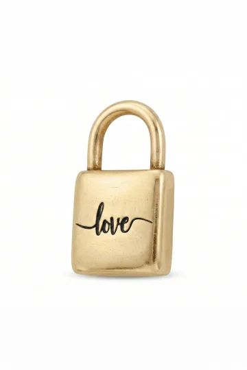
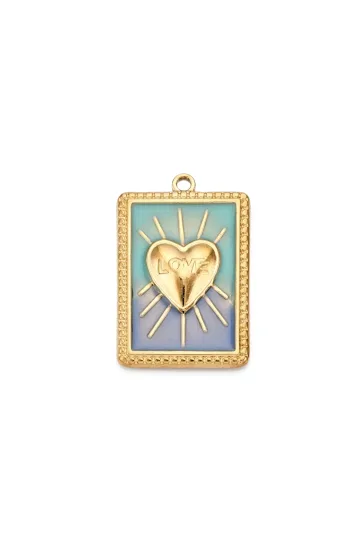
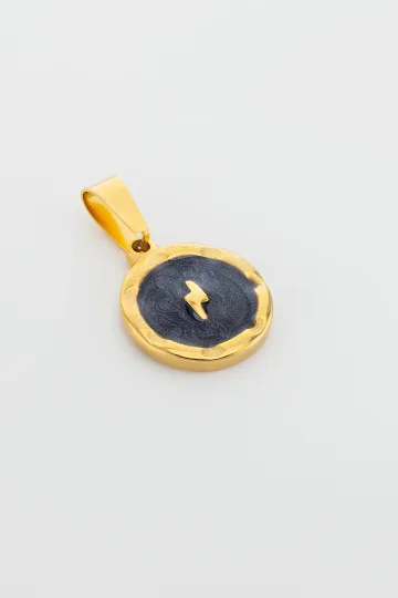
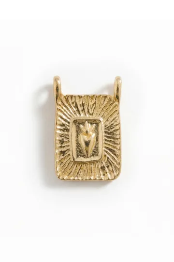
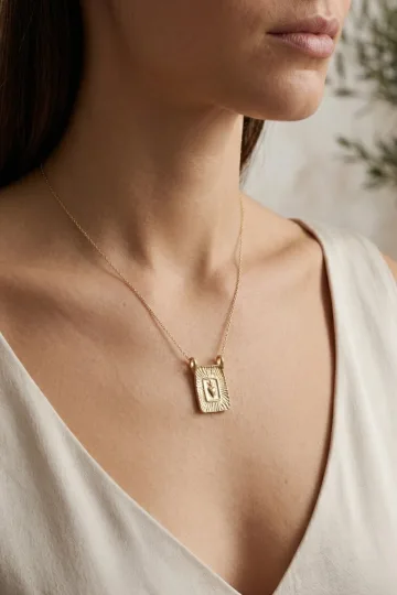
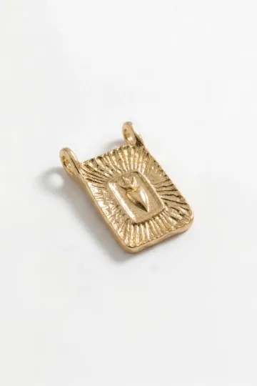
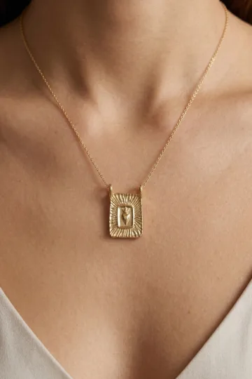
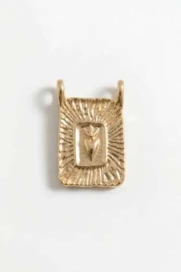
Wear the symbol, don't just read about it. These are in stock:

Words That Work: Which Ones Actually Last
Not every word is right for jewellery. It has to be short enough to read at a glance, deep enough to mean something, and strong enough to carry you through years of wearing.
The Western Trinity: Love, Faith, Hope
Love is the obvious choice, which sometimes makes it feel predictable. But there's a reason it's been engraved into wedding rings and talismans for thousands of years. Love is not about romance alone, it's about believing in connection, in care, in showing up. On a pendant close to your heart or inside a ring, the word Love works quietly. It doesn't announce itself; it reminds.
Faith is different. It's not religious faith, necessarily. It's the faith you have in yourself, in your decisions, in your ability to move forward. In the 15th century, medieval amulets bore the word "Fides" (Latin for faith) as protection against plague and evil eye. Now, Faith on a pendant or signet ring is your personal anchor when doubt creeps in.
Hope became popular during difficult times. It's not naive optimism. It's the active choice to believe tomorrow might be better. Wear it as a reminder that waiting for something better is not passive; it's a form of resistance against despair.
Eastern Words, Different Resonance
Peace is ancient in Buddhist tradition, carved into copper amulets alongside mantras. When engraved in modern jewellery, it's a direct counter to the noise of daily life. Simple, powerful, and it works for any gender or age.
Soul is for people on a journey. It's not a popular choice, but it's deeper than Love. When you wear this word, you're making a commitment to authenticity, to remembering what's real about you underneath all the roles.
Harmony sounds like it was designed for jewellery. Two syllables, balanced letters, deep meaning. People choose this word after conflict, after loss, as a reminder that balance is something you build, not something that happens to you.
Names as Personal Talismans
Sometimes the word you engrave is simply a name. Your own. Your child's. Someone you've lost. A name becomes a word-amulet when it carries the weight of identity and memory. Two-syllable names work best: Sofia, Marco, Elena. Single letters, initials, are their own category, worth exploring in our guide to monograms.
One word at the collarbone. A whole sentence belongs on a postcard, not on a chain, and don't argue.
How to Wear a Word-Amulet
After years on set I have built dozens of looks around engraved pendants and rings. A word in metal wants a calm background and room around it, so let me take it occasion by occasion, where it reads intimate and where it reads loud.
What do I wear a word pendant with every day? For daily wear I recommend a fine chain and an open neck: a V-neck, an unbuttoned shirt, a plain tee under a jacket. A calm solid fabric (cream, grey, sand, olive) gives the word room to be read instead of getting lost in a print. With denim and knitwear I suggest silver or gold plating, because gold reads too formal in daytime casual.
Does it work at the office? It does, as long as you keep it restrained. I choose a neutral word or your name, a simple font, a metal that matches the rest of your jewellery. If you wear a watch, I pick a chain or bracelet in the same tone. A word inside a ring or a short pendant under a closed collar stays a private reminder, not a statement.
How do I build an evening look? For going out I suggest a bare shoulder, silk or velvet, a deep colour in the fabric, and the word starts working as an accent. Layers belong here: a short pendant with the word plus a longer chain with no pendant, and you can mix metals. Rose gold warms the look, white gold and silver add sharpness to a black dress.
And for a special occasion? An engagement, an anniversary, a loved one's birthday. On days like that I recommend wearing the word ("Faith", "Hope", a child's name) closer to the body. One piece and a pair of small studs are enough so nothing pulls focus from the meaning.
How do I choose the length without overloading the look? I set the length to the neckline and not the other way around: the word should sit near the heart, not dangle at the waist. And one word on show beats three: if you want layers, I add empty chains and texture and keep a single accent of meaning.
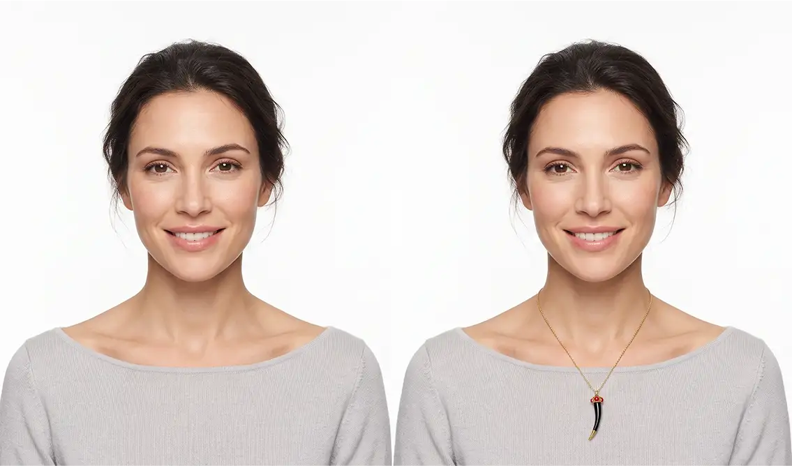
Turn on your camera, pick earrings, a pendant or a ring, and see the piece on yourself in real time.
Switch items in one tap.
Everything runs in your browser: no photo or video is ever uploaded.
Script and Serif: How the Word Looks Matters
The same word reads completely differently depending on how it's carved. This isn't just aesthetics. The style of lettering affects how the word feels against your skin.
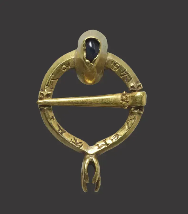
Gothic and Medieval Scripts
If you want your word to feel ancient, choose Gothic. The tall, pointed letters look like something from an illuminated manuscript. It's powerful, mysterious, but it's also harder to read on a small piece and easier to lose detail when the jeweller's tools move quickly. Reserve this for larger pieces or words you want to feel ceremonial.
Serif (Timeless and Serious)
Traditional fonts like Garamond, Times, and other serif styles convey permanence. They look expensive, feel established, and suggest the word has weight. The downside is that serifs require space, on a small pendant, the fine lines of the serifs can blur or disappear. Better for inside a ring or a large bracelet.
Sans-Serif (Modern and Clean)
Helvetica, Futura, and other clean fonts feel contemporary without dating themselves too quickly. A word like "Hope" in sans-serif reads clearly, even on tiny jewellery. It's minimalist, which appeals to modern sensibilities, but it also feels less like a talisman and more like a statement. Use this when you want the word to be understated.
Script and Cursive (Personal and Delicate)
Flowing, connected letters feel intimate. They suggest the word is a secret, something close to you. The problem is readability, if the script is too elaborate, people won't know what the word says, and you'll spend your life explaining it.
Latin Letters vs. Cyrillic
Latin script is universally readable. Cyrillic, Russian, Bulgarian, Serbian letters, creates an exotic quality that non-Cyrillic speakers find mysterious. "Любовь" (Love in Russian) takes up more space than the English word but carries more cultural weight. If you speak Russian and want the word to have deeper meaning, Cyrillic is worth the space it takes.
Latin, Hieroglyphs and Arabic Script
Choosing a script you do not read yourself is the single most common way a word piece goes wrong, so this section is largely a set of warnings.
Latin. The safest of the non-English options, because it uses the alphabet you already read and because a great deal of it is genuinely part of English tradition. Fide (faith), Spero (I hope), Semper (always), Lux (light), Anima (soul). Motto Latin runs through British heraldry, school badges, regimental colours and civic crests, so it looks entirely at home here rather than borrowed. The one caution is grammar: Latin inflects, so a word lifted from a dictionary is often in the wrong case, and the difference between amor and amoris is the difference between a motto and a mistake. Ask someone who reads it.
Egyptian hieroglyphs. Beautiful, and popular since the 1920s, but they carry a specific problem. Hieroglyphs are not an alphabet in the way people assume, and the transliteration schemes used to spell modern names in them are a modern invention rather than an ancient practice. What you get is a decorative approximation. That is fine as long as you know it, and it becomes embarrassing only when someone claims it says their name in ancient Egyptian, which it does not, quite.
Arabic script. Among the most beautiful writing systems in the world for jewellery, because it is cursive by nature and its letters connect into a flowing line that suits a curved surface. It is also the one where errors are most common and most serious. The letters change shape depending on their position in a word, so a design assembled from isolated characters will read as nonsense to anyone who knows the language. Text is also frequently reversed or mirrored by workshops working from an image rather than from type. And a great deal of Arabic script carries religious weight, which means an inscription should be commissioned from someone who understands both the calligraphy and its context rather than copied from a search result.
Chinese and Japanese characters. The same warnings apply with more force, since a single stroke changes the meaning entirely and there is a long and well-documented history of Western pieces carrying characters that mean something quite different from what the buyer was told.
The rule that covers all of these: if you cannot read the script, have the finished artwork checked by someone who can, before it is cut. Metal does not have an undo.
Material: What Metal Should Carry Your Word
The metal you choose affects both the longevity of your word and how it feels to wear.
Sterling Silver: The Honest Choice
Silver is soft, which is why jewellers love it. A word engraves cleanly, without requiring massive pressure. Over time, silver oxidises and darkens, this is patina, and it's beautiful. Your word becomes more readable as it darkens, like it's been inked. Silver is affordable, feels good on skin, and develops character as you wear it.
The catch: silver is vulnerable to salt water. If you live near the ocean or swim frequently, consider gold-plating over your silver. For more on silver, read our complete guide.
Gold-Plated Silver (The Compromise)
A thin layer of gold over silver 925 gives you the best of both worlds. Gold is more durable than silver, so your engraved word stays crisp longer. And psychologically, wearing gold, even plated gold, feels different. It feels more precious. The plating will eventually wear away (usually after 2-3 years of daily wear), but by then you might want to refresh it anyway.
Real Gold (The Forever Choice)
Gold is forever. A word engraved into 14k or 18k gold will outlast you. The letter remains sharp, the shine doesn't diminish (gold is chemically stable), and the piece becomes something you can leave to your children. If your word is truly important to you, gold is the right choice, even if it means saving for it. It's not about luxury; it's about meaning that lasts.
White gold and rose gold both work beautifully for engraved words. Rose gold adds warmth, it's psychologically better for words like Love. White gold is cooler, better for Faith or Hope.
Steel and Other Metals (Proceed With Caution)
Medical-grade steel is durable but cold. It's harder to engrave cleanly, and the word doesn't develop patina or character, it just sits there, unchanged. For most people, steel jewellery feels industrial, not intimate. Skip it.
Copper and Brass
Copper and brass can work if you're going for a traditional, spiritual aesthetic. They're ancient metals, associated with protection amulets across cultures. But they require maintenance, polishing to keep them bright, or allowing them to develop a verdigris patina (which is beautiful if it's intentional).
There is a practical case for them beyond the look. Both are soft, which means they engrave cleanly under hand tools and take fine detail without fighting back, and both are cheap enough that a workshop will happily cut a test piece before committing to the real one. If you are unsure about a word, having it cut in brass first and living with it for a few months is the sensible way to find out whether you still want it in gold.
The drawbacks are real and worth stating plainly. Copper reacts with skin acids and can leave a green mark on the wrist, which is harmless, washes off and irritates a great many people. Brass tarnishes to a dull yellow-brown within weeks. Both need regular polishing, and polishing an engraved surface eventually softens the edges of the letters, which is precisely the opposite of what you want.
There is also the alloy question. Brass is copper and zinc, and cheap brass frequently carries lead or nickel in the mix. Under the European nickel restriction, carried in Annex XVII of REACH, an item in prolonged skin contact must not release more than 0.5 micrograms of nickel per square centimetre per week, and unmarked imported brass often fails that test. If you want the warm colour without the risk, ask for the alloy specification, or use a gold-plated silver instead.
One more note for British buyers. Copper and brass carry no hallmark, since only silver, gold, platinum and palladium are hallmarked here, so there is no independent record of what you are wearing. That is a reason to buy from someone who will tell you.
Customer reviews
Zevira is a real jewellery shop. Genuine payments, deliveries and customer thank-yous.
🥰🥰🥰 gracias
Ok, ¡gracias! 🙂
The Right Word For Your Life Right Now
Not every word is right for every person. Here's how to choose what actually belongs on your body.
Length and Readability
One-syllable words are instant. "Hope, " "Peace, " "Love, " "Soul, " "Fate", you read them before anyone asks what they say. Two syllables still work: "Harmony, " "Destiny, " "Forever" (though Forever is pushing it on a small pendant). Three syllables is your limit. Beyond that, your jewel becomes a puzzle people have to solve by asking you.
For the word itself, aim for 4-6 letters maximum on a small pendant, 6-10 on a bracelet, unlimited inside a ring.
Does It Mean Something to Just You, or To Everyone?
"Blessed" meant something in 2010. Now it feels dated. Stick with words that have carried weight across centuries: Love, Hope, Faith, Peace. Add personal touches with names, places, dates, these never become clichés.
A word that only makes sense to you is even stronger. A private word, something you and one other person share, engraved where only you or they would see it, that's real talisman power.
Will You Still Love It in Five Years?
The best test: say the word out loud every day for a week. If you still feel it on day seven, it's the right word. If you're bored by day three, it's not.
Context Matters: Where and How Often
If you wear the jewellery every day, choose a neutral word or your name. "Peace" on your work badge looks fine. "Chaos" might confuse your colleagues. If this is jewellery for private moments, something you wear at home, or under your shirt, choose whatever word speaks to you, even if it's provocative.
Combining Words With Symbols
Rarely does a word stand alone in jewellery. Usually it's paired with a symbol, for visual balance and added meaning.
Word + Simple Icon
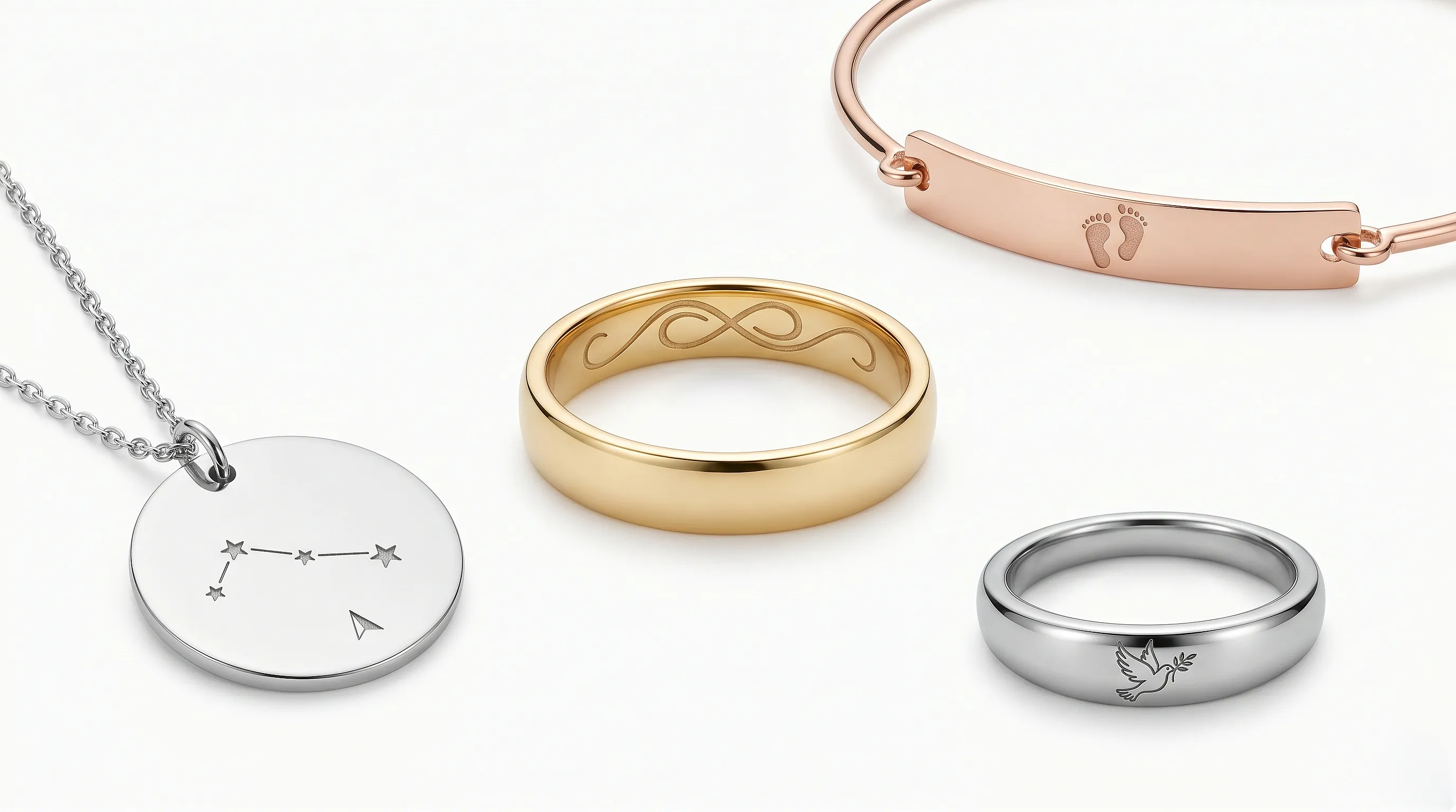
Love with a heart. Faith with a cross. Peace with a dove. This works only if the symbol is minimal, taking up no more than a quarter of the piece. Otherwise it becomes a logo, not a talisman.
A clean layout is: word on top, symbol below, separated by a thin line. Or the symbol is cleverly integrated into the letterforms, a cross built into the T of "Faith," for example.
Word Surrounded by Ornament
For rings, especially wedding bands, a word can be surrounded by delicate flora: grapevines, laurel leaves, roses. It adds history and elegance, but be careful during resizing, the ornament can suffer.
Word as Part of a Larger Composition
A large pendant or brooch can be entirely devoted to one word, with the space around it filled with visual storytelling. Stars, feathers, flames, water, whatever echoes the word's meaning. This is fine art jewellery that also works as a talisman. Both are valid.
Multiple Words on One Piece
"Faith Hope" together on a bracelet. "Love" on one side of a pendant, "Always" on the other. Two short words can work if they harmonize. Don't engrave four different words expecting them to feel cohesive, they won't.
Upload a photo of your pet, someone you love, or an object. We'll build a 3D model and hand-cast it in pewter.


The History of Words in Jewellery
Antiquity: Older Than the Alphabet
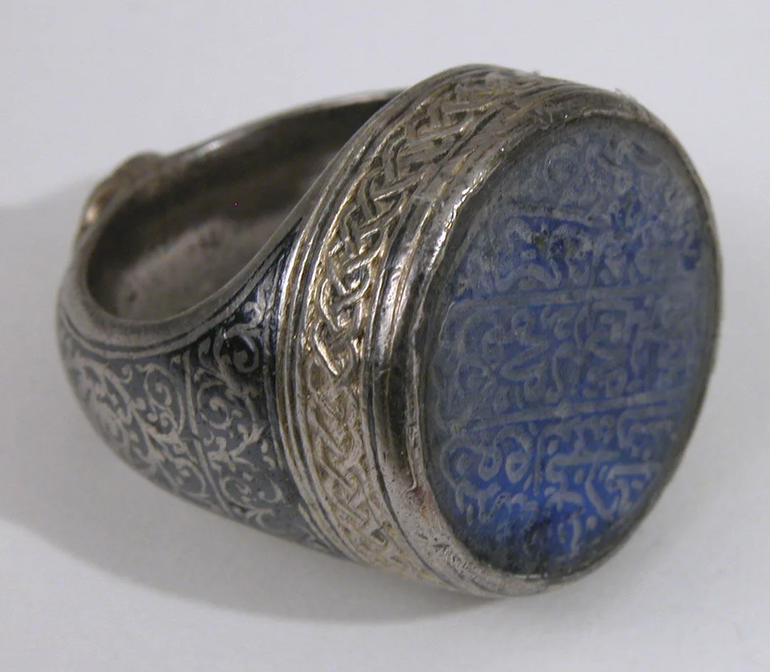
Inscribed jewellery is older than the alphabet, which is a stranger fact than it first appears. Mesopotamian cylinder seals carried cuneiform names and titles, cut into carnelian, lapis and haematite, and were worn on a cord at the wrist. Egyptian scarabs carried hieroglyphic inscriptions on the underside and were mounted in rings. In both cases the object was worn on the body and carried writing, which is the working definition of a word piece.
What those early inscriptions did was legal rather than sentimental. A seal said who you were and made your assent binding, and that function drove the technology: the letters had to be legible, durable and unforgeable, which meant hard stone and skilled carving. Decoration came second.
Greek and Roman practice broadened it. Rings carried owners' names, workshop signatures, good wishes and, increasingly, affectionate messages. Roman betrothal rings sometimes bore short inscriptions to the beloved, and finger rings with the word for "long life" or "good fortune" circulated widely enough that they are found across the empire, including in quantity in Britain.
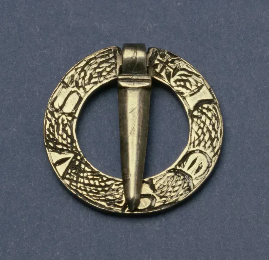
Roman Britain is worth a moment on its own. Excavated sites here have produced inscribed rings, brooches and pendants in silver and bronze carrying names, mottoes and abbreviations, some Latin, some in local hybrid forms. They are ordinary objects belonging to ordinary people, and they establish that the habit of wearing a word arrived on this island roughly two thousand years ago and has not stopped since.
Medieval and Renaissance Europe
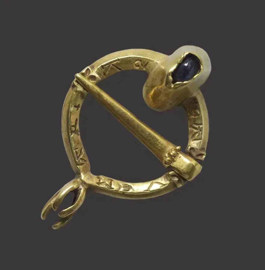
Medieval amulets bore Latin words, "Protego" (I protect), "Salus" (Health), "Victoria" (Victory). These weren't just decoration; they were believed to carry the power of language itself. By the Renaissance, the tradition softened. Engraved rings became love tokens between sweethearts, each bearing a word or phrase of devotion.
The Renaissance: A Language of Love
Between roughly the fourteenth and the seventeenth centuries the inscribed ring stopped being an instrument of authority and became an instrument of feeling, and that shift is the single most important thing that ever happened to word jewellery.
Several conditions came together. Literacy spread beyond the clergy and the administration. Goldsmithing improved enough that fine lettering could be cut inside a narrow band. And courtly culture placed enormous weight on the well-turned phrase, so a short line of verse became a proper gift between people who could not say much else openly.
The results were extraordinarily varied. Rings carried lines in Latin, in French, in English and in mixtures of all three. Some were declarations, some were riddles, some were jokes, and a surprising number were faintly world-weary. What unites them is compression: the whole message had to fit in a circle a few centimetres round, which forced a discipline on the writing that a letter never demanded.
Language mattered as much as sentiment. French carried prestige and was the polite language of love across European courts, so a French phrase on an English ring signalled education as much as affection. Latin carried gravity and was used for oaths and for anything meant to sound permanent. English, when it appeared, tended towards the plain and the direct, which is why the surviving English examples read so freshly now.
The Renaissance also fixed a convention that still holds. The most serious inscription goes where only the wearer can see it. That instinct, to hide the real message inside the band and leave the outside plain, runs directly from these rings to the modern practice of engraving the inside of a wedding band, and it explains why the tradition survived every change in fashion since.
18th and 19th Century
In Russia, monograms and ciphers (intertwined letters) were the mark of nobility. Not quite words, but the same principle, your mark, in metal, as your signature. In Victorian England, mourning jewellery bore the names of the deceased or symbolic words like "Remember" and "Forever."
20th Century Democratization
By the 1950s in America, bracelets and charms with three-letter words ("Mom," "Dad," "Baby") became mass-produced. This removed the craft from the practice but made it accessible. Anyone could now wear their talisman.
21st Century: Psychology Meets Minimalism
Now we engrave words as self-care. "Breathe, " "Grounded, " "Enough", words that help us survive modern anxiety. Minimalist aesthetics mean the word itself is the only decoration. The result is jewellery that looks contemporary but feels timeless.
Secret Messages: Posy Rings, Lockets, Acrostics
The most interesting word jewellery in history was designed not to be read by anyone except the person wearing it. That constraint produced some genuinely clever solutions, and every one of them is still available to a modern buyer.
Posy Rings: Verse Inside the Band
The posy ring is the great English contribution to the subject, and museums here hold them by the hundred. The name comes from poesy, meaning a short verse, and the format is exactly what it sounds like: a plain gold band, undecorated on the outside, carrying a line of verse engraved around the inside where it touches the skin.
They ran from roughly the fifteenth century into the eighteenth, and at their peak they were ordinary rather than exceptional. A goldsmith kept a stock of bands and a book of suitable lines, and a customer chose one much as a person now chooses from a list of engraving fonts. The surviving inscriptions are plainer and better than the modern equivalent tends to be: promises of constancy, requests to be remembered, statements that the giver's heart is fixed. Some are witty. A few are clearly resigned.
The physical constraint shaped the writing. A band takes roughly thirty to forty letters at a readable size, which is a line of verse and no more, so the form enforced brevity in a way that produced surprisingly good compression. Most run to a single rhyming couplet or a short prose vow.
Two details matter for anyone commissioning something similar now. First, the inscription goes inside because it is private, and the whole effect collapses if you also put something on the outside. Second, an inside inscription against skin wears slowly but does wear, so it should be cut deeper than an outside one, not shallower. Museum examples that have been worn for decades still read clearly precisely because the original engraver cut with that in mind.
Lockets: A Word Beside the Face
The locket solves the same problem differently. Instead of hiding text against the skin, it hides it inside a hinged case, alongside a portrait, a lock of hair or a folded scrap of paper.
The form flourished in the nineteenth century, when photography made a small portrait available to ordinary households for the first time, and the combination of image and inscription became the standard object of remembrance. A name and a date on the inside of the cover, a face opposite. Nothing on the outside except ornament.
What the locket adds over an engraved band is layering. There is what the world sees, which is a piece of jewellery; there is what the wearer knows, which is what is inside; and there is the act of opening it, which is deliberate and private. That sequence is why lockets carry such disproportionate emotional weight relative to their material value.
For a modern piece, the practical notes are these. Engrave the inside of the cover rather than the outside, since the outside will be polished over the years and the inside will not. Keep the text short, because a locket interior is small and a long inscription competes with whatever is opposite it. And check the hinge before buying anything antique, because a worn hinge is the commonest failure and a difficult repair.
Mourning Inscriptions
The Victorians built an entire industry on inscribed remembrance, and it remains the most emotionally direct word jewellery ever made.
The standard vocabulary was small: a name, dates of birth and death, occasionally an age, and one of a handful of words. In memory of. Not lost but gone before. Remember. The materials were equally standardised, jet from Whitby, black enamel over gold, woven hair under glass, and pearls to signify tears.
The reason the tradition mattered is that these objects were made to be worn in public. A mourning ring or brooch was a social signal, announcing a loss and claiming a period of formal grief, and the inscription made it specific rather than generic. It named the person. In a culture with high mortality and elaborate social rules about grieving, that was a serious function rather than a sentimental one.
The custom faded in the twentieth century, and something was lost with it, since there is now very little accepted vocabulary for carrying a loss visibly. A modern equivalent, a name and a date engraved inside a plain band or on the back of a pendant, is quietly common and does the same work. It does not need to look Victorian to function the same way.
Acrostics in Stone: Regard and Dearest
The cleverest solution of all uses no letters whatsoever. In an acrostic piece, a row of gemstones spells a word through the first letter of each stone's name.
The two classic sequences are REGARD, made of ruby, emerald, garnet, amethyst, ruby and diamond, and DEAREST, made of diamond, emerald, amethyst, ruby, emerald, sapphire and topaz. Both were fashionable in the early nineteenth century, and both look to an uninformed eye like nothing more than a pretty row of coloured stones.
The device came into Britain from French jewellery, where the fashion started, and it spread quickly because it suited the period exactly: sentiment was expected, explicitness was not, and a message that only the recipient could decode was ideal. Other sequences existed, including names, and a jeweller with a wide stock could spell a fair range of short words.
There are constraints. The alphabet available is limited to stones that exist and can be matched in size, so letters like K, X and W are difficult, and the whole word has to be short enough to sit in a row on a ring or a brooch. Substitutions were common and slightly elastic, with lapis standing in for L and vermeil for V.
As a modern commission it is one of the few genuinely original things left to do with a stone-set ring, and it has an advantage over an engraving: it can never wear away. The message is structural rather than cut into the surface.



Engraving Techniques
Four methods dominate, and they produce visibly different results. Knowing which one a workshop is using tells you more about the finished piece than any description of the metal.
Hand Engraving
The oldest method and still the best. The engraver holds a graver, a hardened steel tool with a shaped cutting point, and pushes it through the metal, removing a curl of material with each stroke. Nothing is burned, melted or abraded. Metal is cut away.
The distinguishing quality is the cut itself. A hand-cut line has a bright, faceted floor that catches light, and its width varies as the engraver changes pressure and angle, so letters have thick and thin strokes exactly as good calligraphy does. Under a loupe you can see the individual tool marks. That variation is what makes hand engraving look alive next to any machine method.
It is also slow, which is the whole cost. An experienced engraver cutting a short word inside a band works for a substantial part of an hour, and a decorated monogram can take a day. There is no undo, so the engraver is working under real pressure, and skill is unevenly distributed. Ask to see previous work.
Choose hand engraving for anything with sentimental weight, for script and calligraphic lettering, for curved and awkward surfaces, and for anything you want to look like it was made by a person.
Laser Engraving
A focused beam removes or discolours a very thin layer of the surface. The machine works from a digital file, so it reproduces any typeface, any logo, a signature, a fingerprint or a photograph with total consistency.
The strengths are precision and repeatability. A laser will place a line 0.05 mm wide exactly where the file says, hundreds of times identically, on a surface too small for a hand tool to reach comfortably. It is the only sensible method for very fine text, for reproducing handwriting exactly, and for hard metals like steel and titanium that resist hand tools.
The weakness is depth and character. Laser marking on precious metal is shallow, often a matter of hundredths of a millimetre, and it tends to look grey and matte rather than bright and cut. On a ring's inner surface, which rubs against a finger for decades, a shallow laser mark can genuinely fade in a way a hand-cut one will not. Deeper laser engraving is possible but takes multiple passes and starts to lose its cost advantage.
Choose laser for handwriting reproduction, for very small text, for steel and titanium, and where an exact digital reproduction matters more than the quality of the line.
Etching
The metal is coated with an acid-resistant ground, the design is scratched through the ground, and the piece goes into an acid bath that bites away the exposed metal. It is the same process that produced printed illustrations for four hundred years.
Etching gives a flat-floored, matte recess with slightly soft edges, which is a distinct look rather than a worse one. It suits large areas, textures, patterns and anything where you want a broad shallow depression rather than a fine bright line. It handles complex repeated designs cheaply, because the acid does not care how complicated the drawing is.
It is less suited to fine lettering, since the acid undercuts slightly at the edges and small counters in letters can fill in. It also involves chemicals that need proper handling and disposal, which is why fewer small workshops offer it now than did fifty years ago.
Stamping and Punching
A hardened steel punch carrying a letter is struck with a hammer, displacing the metal rather than removing it. This is the oldest method of all and the one used for hallmarks.
The look is unmistakable: each letter sits in its own slightly raised impression, spacing is never perfectly even, and the whole thing has a handmade, industrial honesty to it. It suits short words in block capitals, and it suits flat surfaces, since a punch on a curved surface distorts.
The advantages are speed, low cost and permanence, because displaced metal does not wear away the way a shallow cut does. The disadvantages are that the letters must come from an existing punch set, so typeface choice is limited, spacing is done by eye, and a mis-struck letter cannot be removed.
It is worth knowing that this is how a British hallmark is applied. The Assay Office punches the marks physically into the metal, which is why they can still be read on a piece worn for two centuries, and why a hallmark that looks laser-etched should raise a question.
Modern Formats: The Word Without Letters
A recent and genuinely useful development. If the point of the piece is that only you know what it says, letters are the weak link, since anyone can read them. These four formats keep the meaning and lose the legibility.
Morse Code
A word is rendered as dots and dashes, translated into beads, engraved marks or set stones. Love becomes four groups; a name becomes a rhythm. To anyone else it reads as an abstract pattern of round and elongated shapes, which is why it works so well on a bracelet.
The format has real advantages. It fits a long word into a small space, because a dot is smaller than any letter. It reads as pure ornament, so it never looks like a slogan. And it works equally well in beads on a cord, in engraved marks on a bar, or in alternating round and baguette stones on a band.
Two practical points. Decide in advance how you are separating letters, since the gaps carry as much information as the marks and a design that ignores them is not actually decodable. And keep the word short, because Morse expands rapidly and a six-letter name can run to twenty marks.
The code dates from the 1830s and 1840s, which gives the format a legitimate historical footing rather than making it a novelty.
Coordinates
Latitude and longitude engraved as numbers, marking a specific place: where you met, where you married, where a child was born, where someone is buried, the house you grew up in.
Numbers are the appeal. A string of digits and symbols looks technical and impersonal to a stranger and means one exact spot on the earth to you. It is the most discreet way to wear a place.
Practical notes worth having. Decide the format before commissioning, since degrees, minutes and seconds looks more traditional and decimal degrees is shorter. Four decimal places locates a spot to about eleven metres, which is precise enough for a building, and adding more digits simply makes the engraving longer. And check the figures twice, because a transposed digit puts your meaningful place in the North Sea and nobody will notice until years later.
The Sound Wave
A recording is converted into a waveform, the jagged profile of amplitude over time, and that shape is engraved or cut into metal. A child's laugh, a voice saying a phrase, a heartbeat from a scan.
It is the most emotionally direct of the four and the most technically demanding, because the visual quality depends entirely on the source. A clean recording of a short phrase produces a distinctive shape; a long or noisy one produces a grey smear. Keep the clip under about three seconds.
Some versions add a scannable code so the recording can be played back, which is charming and has an obvious weakness: the code depends on a service that must still exist in twenty years. Treat the playback as a bonus and the engraved shape as the actual object.
Fingerprints and Handwriting
The most personal formats available, and the most quietly devastating, since both are unique to one individual and both survive them.
Handwriting. A signature, a single word, or a line from a letter or a card, scanned and reproduced exactly. Laser handles this best, because it can follow the original stroke widths precisely. The material has to be good: a clear scan of the original, at high resolution, on plain paper. A photograph of handwriting taken at an angle produces a distorted reproduction.
Fingerprints. Taken with ink on paper or with a proper scan, and reproduced either as an engraved line pattern or as a raised impression. The result looks like texture to anyone who does not know what it is.
Both are frequently commissioned after a death, using a card, a note or a print already on file, and both are among the few things a jeweller can make that genuinely help. A word chosen from a letter, in the handwriting of the person who wrote it, is a stronger object than any engraved name.
Leave your email, we'll send your discount code. No spam, unsubscribe anytime.
The code arrives by email, valid on your first order.
Keeping the Inscription Legible
An engraved word is a shadow before it is a shape. What you actually see is not the cut itself but the darkness inside it against the brightness of the surrounding metal, and everything about legibility follows from that.
This is why a freshly cut inscription in polished silver can be nearly invisible. The floor of the cut is as bright as the surface around it, there is no contrast, and the word disappears at arm's length. Time fixes it. Silver oxidises, the recesses hold the darkening because they are protected from rubbing, and after a few months the word reads clearly. Silver inscriptions improve with age, which is unusual among jewellery problems.
Gold does not oxidise, so it never develops that contrast on its own. A word cut into yellow gold and left alone stays faint. Workshops solve this three ways. Oxidising or blackening applies a chemical patina to the recesses and polishes it off the surface, which gives immediate strong contrast and lasts for years on a protected surface. Enamel filling packs the cut with black enamel, fired hard, which is the most durable solution and the reason Victorian mourning inscriptions still read perfectly. Sandblasting or matting the floor of the cut breaks up reflection so the letters read as grey against bright, which is subtle and never fully disappears.
There are things you can do and things you should not. A soft toothbrush and warm soapy water lift the grime that dulls an inscription without touching the darkening in the recesses, and that is the whole of routine care. Polishing cloths and pastes are the enemy, because they work on the high surface and, applied repeatedly, round over the sharp upper edges of the letters until the word softens into a smudge. Anything abrasive, applied often, is slowly erasing your engraving.
Two cases deserve special caution. An inscription inside a wedding band is under constant gentle abrasion from the finger, so it should be cut deep at the outset and never machine-polished during resizing. And a plated piece cannot be polished at all without cutting through the plating, so any refresh means re-plating, and re-plating fills a shallow engraving.
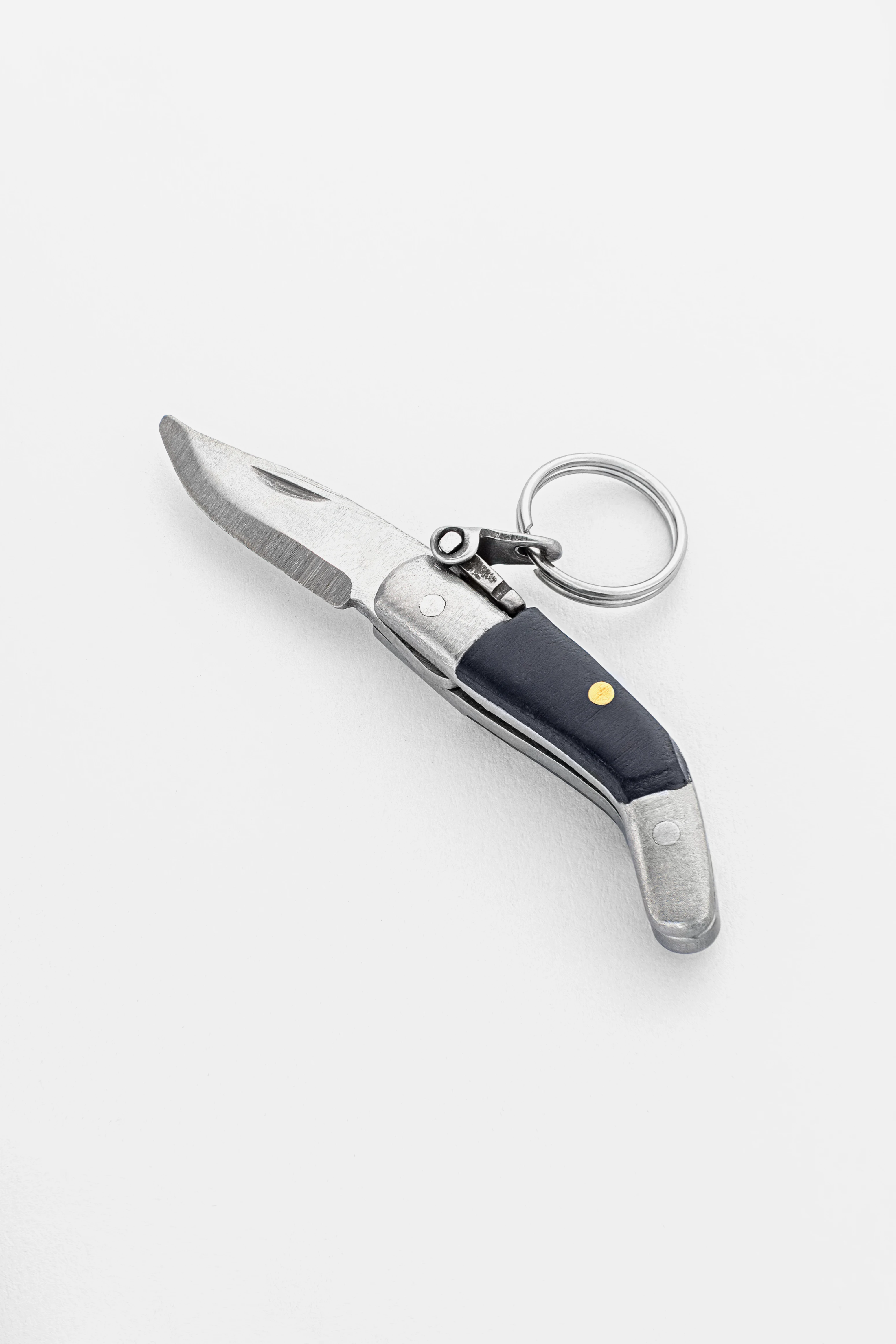
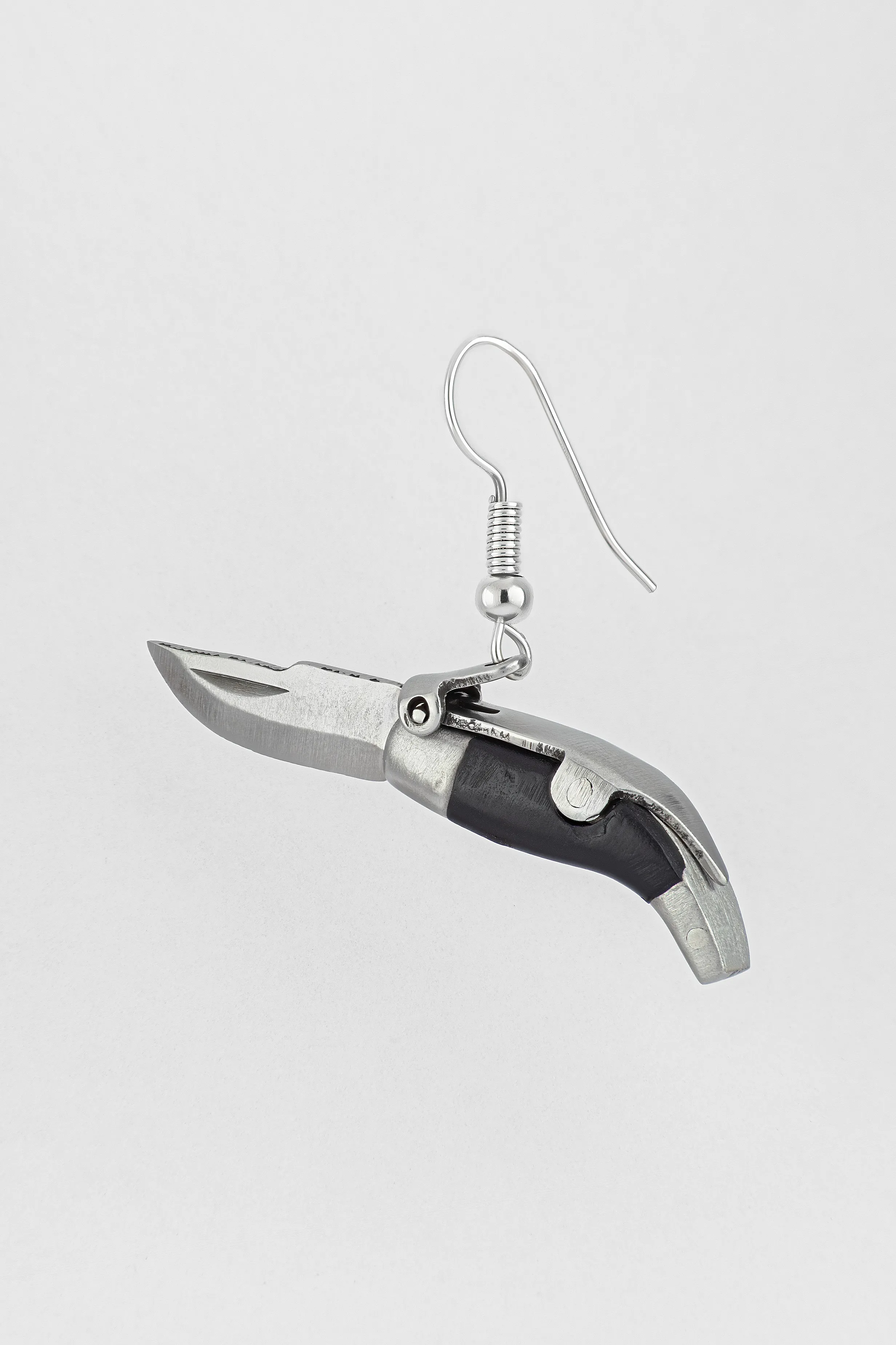
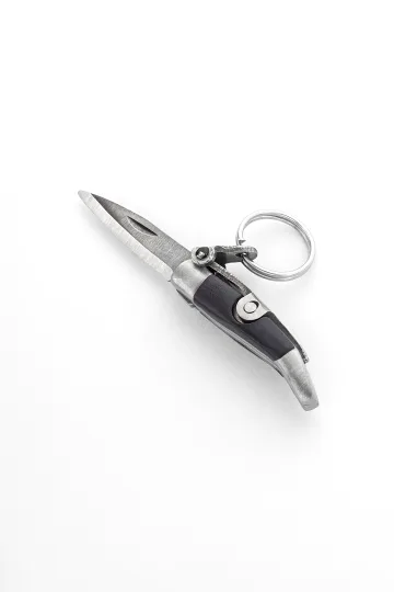
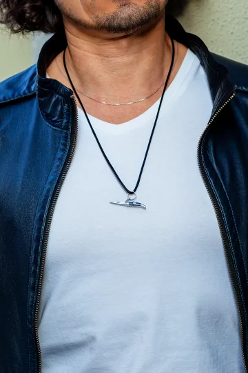
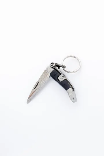
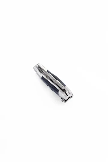
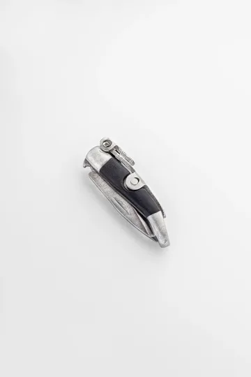
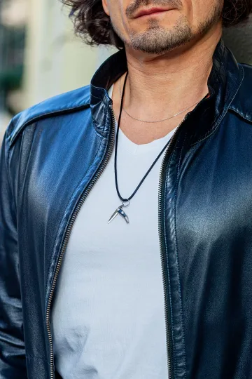
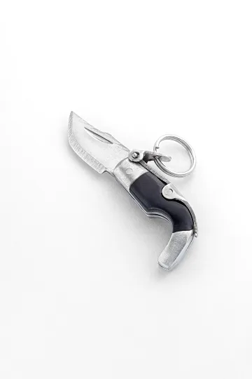
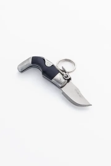
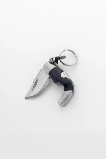
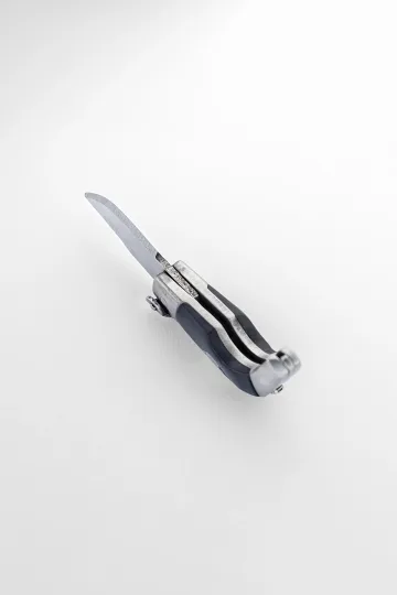
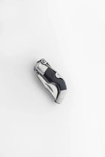
CAPAORA mini knife pendant
The 18th-century Spanish navaja in miniature: 40 mm of stainless steel, a real folding mechanism and a Palanquilla lock that clicks. An affordable gift to remember.
Authentic · Ships from Spain · 14-day returns
Geometry: Where the Word Will Actually Fit
The commonest disappointment with a word piece is not the word or the font. It is that the word did not fit, and nobody worked that out before cutting.
Here are the actual numbers. Inside a ring band you have the full inner circumference, which on a typical adult size is roughly 55 to 62 mm, less a margin at each end. At a comfortable letter height of 1.5 to 2 mm you get about thirty to forty characters including spaces, which is one short line. Outside a ring band you have far less usable room, because the band curves away from the eye in both directions, and only the front third reads properly, giving perhaps eight to twelve characters.
A round pendant of 15 mm diameter takes a single word of about six to eight letters across its face at a readable size, or a longer word curved around the edge. A rectangular bar pendant, typically 25 to 30 mm long, is the most generous format in common use and takes ten to fourteen characters comfortably on one line, which is why bar necklaces became the default for names.
A bracelet bar offers similar space to a pendant bar. The back of a pendant is the underrated option, giving you the full disc uninterrupted by any design, and it is where a longer private inscription belongs. Cufflinks and lockets take initials and dates, little more.
Three rules make the difference between a good result and a cramped one. First, letter height should not go below about 1.2 mm for anything you want to read without glasses, and about 0.8 mm is the practical floor for laser on any surface. Second, curved surfaces need larger letters than flat ones at the same apparent size, because the curve takes some of the height out of the reading angle. Third, always leave margin: text running to the very edge of a piece looks like an accident and, on a ring, gets cut into during any future resizing.
The single most useful thing you can do before ordering is print the word at the intended size on paper, cut it out and hold it against the piece. It takes two minutes and it prevents the most expensive mistake in the category.
Checking the Engraver's Work
Whatever you have commissioned, spend five minutes inspecting it before you leave the counter or before the return window closes. Almost everything that goes wrong is visible immediately and fixable only immediately.
Read it aloud. Slowly, letter by letter, against what you wrote on the order. This sounds absurd and it catches the single most common failure, which is a transposed or missing letter that the eye slides over because it knows what the word is supposed to say. Dates and coordinates need reading digit by digit.
Check the spacing. Letters should sit on a consistent line with even gaps. Punched and hand-cut work will show slight natural variation, which is fine and desirable. What is not fine is a word that drifts upward, crowds at one end, or has a visibly larger gap where the engraver ran out of room.
Look at the depth under a light. Tilt the piece. Every stroke should catch light at the same moment, meaning the cut is even. Strokes that appear and vanish at different angles mean uneven depth, which will wear unevenly and look worse each year.
Check the ends of strokes. On hand engraving, each line should terminate cleanly. Ragged ends, small metal burrs at the exits, or a visible scratch running past the end of a letter all mean rushed work.
Look for collateral damage. Slips happen. A stray scratch across the surface near the inscription, a mark where a tool rested, a dented edge from clamping. Look at the whole face of the piece rather than only at the letters.
Verify the finish. The area around the engraving should have the same finish as the rest of the piece. A polished patch around the letters means the engraver polished out a mistake, and you should ask what it was.
On silver and gold, check the hallmark is intact. A UK piece over the weight threshold carries assay marks, and these should not have been damaged, polished flat or engraved through during the work.
If something is wrong, say so at once and in person. A workshop that made the error will usually recut or replace, and a shallow error on silver can often be polished out and redone. The one thing that cannot be recovered is a complaint made six months later.
What People Choose Most Often
Having covered what is possible, here is what actually gets ordered, drawn from the categories that recur constantly.
Romantic Words
The largest category by a wide margin, and the one where the difference between a good choice and a poor one is greatest.
The standard vocabulary is love, always, forever, yours, mine, beloved, my heart. They work because everybody understands them instantly, and they fail for exactly the same reason: a piece saying forever looks like every other piece saying forever.
The better romantic inscriptions are specific rather than universal. A date. A place name. Two initials. A word that only means something to two people, which is the entire principle behind the posy ring and remains the strongest approach available. If a stranger reading it would understand it completely, it is probably too generic to be interesting.
The other consideration is durability of meaning, and it deserves honesty. Romantic inscriptions are the ones most often removed later, and silver takes a recut far more easily than gold does. That is not an argument against them. It is an argument for cutting them where they are private, so that if circumstances change the piece can simply be worn plain.
Words as Reminders
The fastest-growing category, and the most modern in spirit. These are instructions to oneself rather than messages to another person: breathe, enough, begin, stay, persist, not yet, keep going.
They work because the mechanism is real and does not require believing anything supernatural. A physical object touching the skin is a cue, and a cue attached to a specific intention genuinely does prompt recall. That is a plain observation about how habits and reminders function, nothing more.
The design implication is that these should be worn where they can be touched rather than where they can be seen. A ring you can turn with your thumb, a bracelet bar under a cuff, a pendant that sits inside a shirt. Placement matters more here than in any other category, because the piece is doing a job rather than making a statement.
One caution. Words tied to a particular difficult period can outlive their usefulness and become a reminder of the period rather than of the resolve. Choose something you would still want in five years, and if you are not sure, have it cut in silver rather than gold.
Family Words
Names of children, names of parents, dates of birth, a word in a family language, initials of a whole household. Steady, unfashionable and the most likely of all these categories to be kept for a lifetime.
The practical advice is mostly about space. Full names run long, so a bar pendant or the inside of a band is the right format, and multiple names need either a larger piece or several small ones. Dates are more compact than names and often more moving. Initials are the most compact of all and, on a small pendant, usually the most elegant.
There is a design decision worth thinking about with children's names. A piece carrying one name is complete; a piece carrying two names has to be balanced; a piece carrying three or more becomes a list. If more children are possible, choose a format that can be added to, such as separate small discs on one chain, rather than one engraved bar that will need replacing.
Family words also travel well across generations, which few other categories do. A grandmother's name engraved inside a band means something to a grandchild in a way that forever never will.
Rare and Personal Words
The smallest category and the most interesting. Words nobody else is wearing: an unusual noun, a word from a dialect or a family language, a term from a field of work, a word from a book that matters, a made-up word two people share.
The argument for them is straightforward. A common word is a category; a rare word is a question. It invites a conversation about why you chose it rather than an assumption about what you feel, and that difference makes the piece genuinely yours.
Sources worth mining: regional dialect words, of which Britain has an enormous stock and which carry a specific place with them; old words that have fallen out of use; the technical vocabulary of whatever you actually do; a word in a language a grandparent spoke.
Two cautions. Check the meaning properly if the word comes from a language you do not read, and check current usage as well as the dictionary sense, since words drift. And avoid anything that reads as a brand or a slogan, because the whole appeal of a rare word evaporates the moment it looks marketed.
Words in Eastern Traditions
Four traditions of inscribed jewellery that developed independently of the European one, each with conventions that a Western buyer should understand before borrowing from them.
Chinese Characters
Chinese characters carry meaning directly rather than through sound, so a single character can hold a complete idea. That density is the whole appeal for jewellery: one small mark, one full concept. Characters commonly chosen include those for longevity, double happiness, fortune, peace and love, all of which have long histories in Chinese decorative arts and appear on jade, gold and silver going back centuries.
The character for double happiness deserves a note, since it is a specifically marital symbol, formed by doubling the character for joy, and it appears on Chinese wedding goods of every kind. Wearing it casually is roughly equivalent to wearing a wedding motif without a wedding.
The risks are well documented. A stroke added, omitted or misplaced changes the character into a different one or into nothing at all. Simplified and traditional forms differ, and which one is appropriate depends on context. And characters chosen from an internet list are frequently wrong, out of date, or grammatically incapable of standing alone.
The correct approach is to have the character written or approved by someone literate in the language, supplied as artwork rather than as a description, and checked once more against the finished piece.
Japanese Calligraphy
Japanese practice adds an aesthetic dimension that the other traditions do not emphasise as strongly: in calligraphy, how the character is written carries as much weight as which character it is. The same word brushed by two hands is two different objects.
Japanese uses kanji, characters shared in origin with Chinese, alongside two syllabic scripts. Kanji carry the concentrated meanings suitable for jewellery, while the syllabaries are used for grammar and for foreign words, which is why a name transliterated into Japanese uses katakana and looks quite different from a kanji inscription.
Concepts that recur in jewellery include those for harmony, quiet simplicity, impermanence and the appreciation of imperfection, all of which are genuine aesthetic terms with real weight in the culture rather than decorative slogans. Using them accurately requires understanding what they actually mean, which is often narrower and more specific than the English summaries suggest.
Reproducing brushed calligraphy in metal is technically demanding, because the interest of the stroke lies in its varying width, its texture and the moments where the brush ran dry. Laser handles this best from a high-quality scan of an actual brushed original. A digital font imitating calligraphy loses most of what makes it worth having.
Arabic Calligraphy
Arabic script is arguably the world's most beautiful writing system for jewellery, and it comes with the most responsibility attached.
Its suitability is structural. The script is inherently cursive, letters connect, and a line of Arabic naturally forms a flowing band that follows a curve, which is exactly what a ring or a bracelet needs. Calligraphic styles range from the angular and architectural to the fluid and rounded, each with its own conventions and its own appropriate uses.
Much of what is inscribed on Arabic jewellery is religious text, and that carries obligations. Conventions exist about how such text should be treated, where it may be worn and how it should be handled, and they are taken seriously by the people who observe them. Anyone commissioning religious text should do so through someone who understands those conventions rather than treating the script as decoration.
Secular inscriptions, names, single words, lines of poetry, avoid that question entirely and remain beautiful. The technical warnings stand regardless: letters change shape by position, the script runs right to left, and workshops working from an image frequently mirror or disconnect it. Have the artwork verified by a reader before it is cut.
Sanskrit and Devanagari
Sanskrit inscriptions, usually written in the Devanagari script with its distinctive horizontal line running along the top, appear widely in Western jewellery, most often as syllables and short phrases drawn from Hindu and Buddhist practice.
The script itself is well suited to a bar or a band, because that continuous top line gives a natural horizontal structure that other scripts lack. Devanagari is also more forgiving at small sizes than Chinese characters, since it is broadly alphabetic.
The cultural point is worth making directly. Many of the syllables and phrases most commonly sold in Western jewellery are living devotional material with specific meanings and specific contexts of use in traditions practised by many millions of people today. They are not ornaments, and treating them as such is the sort of thing that gives the whole category a bad name. If a phrase is meaningful to you through your own practice or study, wear it. If it was chosen because the shape looked good, choose something else.
Technically, the usual warnings apply with extra force, since Devanagari uses conjunct forms where consonants combine into single shapes, and these are routinely rendered wrongly by workshops working from images.
Send a friend a discount code, they save on their first order.
Facts That Surprise
The Oldest Inscribed Jewellery Predates the Alphabet
Cylinder seals carrying cuneiform were worn on the wrist in Mesopotamia long before any alphabetic script existed. Cuneiform is not an alphabet, it is a syllabic and logographic system, so people were wearing writing before writing worked the way we now assume it must.
A Posy Ring Could Cost Less Than the Line Cut Into It
A plain gold band was a commodity and the engraver's labour was not. In periods when a goldsmith kept stock bands ready and cut to order, the skilled work of cutting thirty legible letters inside a curved surface could account for a substantial share of what the customer paid. The message was worth more than the metal, which is a pleasing thing to be literally true.
The Ring as a Signature Lasted Thousands of Years
From Mesopotamian seals through Egyptian scarabs, Greek and Roman intaglios, medieval signets and on into the nineteenth century, a ring pressed into wax was legally binding. That is a continuous run of roughly four thousand years for a single technology, ended not by a better idea but by the gummed envelope and the spread of reliable handwriting as identification.
A Word Could Hide in the Colour of Stones
The acrostic ring spells a message through the initials of its gemstones, so the piece carries text while containing no letters at all. It is one of the few genuinely uncrackable formats in the history of the subject, because a viewer has to know both that a code exists and which stones are which.
A Typo Outlives Everyone Who Noticed It
Surviving inscribed rings and brooches carry misspellings, reversed letters, and words that ran out of room and were finished in a smaller hand. The engraver noticed, the owner noticed, and neither could do anything about it. Several centuries later the error is a documented feature, catalogued and photographed. Permanence is indifferent to whether the thing being made permanent was correct.
The Better Hidden a Word Is, the Longer It Survives
This is a physical fact rather than a poetic one. An inscription on an outer surface is polished, rubbed and knocked for its whole life and softens steadily. An inscription inside a band, on the back of a pendant or inside a locket is protected, and museum pieces routinely show a crisp interior inscription on a piece whose exterior decoration has worn nearly smooth.
You Can Now Wear a Sound
The conversion of an audio waveform into an engraved profile is a genuinely new capability, dependent on cheap digital recording and computer-driven cutting, and it has no historical precedent. In four thousand years of putting messages on the body, this is one of the very few formats that could not have existed before.
FAQ: Everything You're Wondering
How much does it cost to engrave a word?
If you're buying ready-made jewellery and adding engraving, it usually costs a modest amount, on the order of a casual lunch out, depending on the word's length and complexity. If you're commissioning a piece with custom engraving, the cost is part of the overall design price.
Does an engraved word have actual magical power?
Philosophically, yes. Psychologically, definitely. If you believe a word guides your behaviour, it does. The word itself isn't magical; your commitment to it is. The metal is just a way to make that commitment physical.
Can I engrave a child's name?
Yes, but keep it short. Eva, Liam, Nova work. Elizabeth doesn't. For kids, a single initial on a bracelet or small pendant is often more elegant than the full name.
What if I change my mind?
On silver, a jeweller can re-engrave over the old word. On gold, it's pricier but possible. Stainless steel is almost impossible to cover. Think seriously before you commit. But also know that most words people regret are the trendy ones. Stick with classics and you won't want to change it.
Does the engraving wear away with wear?
Not quickly. On silver, the word becomes darker and more prominent due to oxidation, the opposite of fading. On gold, it stays sharp. The only reason you'd lose readability is if the original engraving was done poorly, or if you're constantly grinding the piece against concrete. Normal wear won't diminish it.
What are underrated words worth considering?
Instead of "Love," try "Beloved." Instead of "Peace," try "Tranquil." Instead of "Hope," try "Persist." Uncommon words feel more personal because fewer people share them. A word like "Ember" or "Cipher" becomes a conversation about your inner world, not a cliché.
Can I engrave a full sentence?
Technically yes, practically no. Even "Love you" looks like a greeting card when engraved. A single word, or two short words maximum, is the limit. Jewellery is not a billboard.
The exception is the inside of a ring band, which is the one surface with room for a full line, and the one place where a longer inscription has genuine precedent. Roughly thirty to forty characters fit at a readable size. That is a posy ring, and a short vow in that position reads properly because it was never intended to be seen by anyone else.
What letter size should I ask for?
Between 1.5 and 2 mm is the comfortable range for anything you want to read at arm's length without effort, and it is what most workshops use by default. Below about 1.2 mm the word starts needing good light and reasonable eyesight. About 0.8 mm is the practical floor for laser and produces something that reads as a texture rather than as text.
Curved surfaces need to go slightly larger than flat ones for the same apparent legibility, because part of the letter height is lost to the angle. And bear in mind that a name engraved for a child will be read by that child in fifty years, when their eyes are not what they were, so err upward.
Can the word be encoded instead of spelled out?
Yes, and it is often the better choice. Four established formats do this: Morse code rendered as marks or beads, an acrostic spelled through the initials of set gemstones, coordinates giving a place rather than a word, and a sound waveform. All four carry a specific meaning while reading as pure ornament to anyone who does not already know.
The acrostic is the most historically interesting and the most durable, since the message is structural rather than cut into a surface and therefore cannot wear away. Morse is the most compact. Coordinates are the most discreet.
What is a REGARD ring?
An acrostic ring set with a row of gemstones whose initial letters spell the word: ruby, emerald, garnet, amethyst, ruby, diamond. It was fashionable in the early nineteenth century, arriving in Britain from French jewellery, and its companion sequence was DEAREST, using diamond, emerald, amethyst, ruby, emerald, sapphire and topaz.
The appeal then and now is that the ring looks like an attractive row of coloured stones and says something quite specific to anyone who knows the convention. Genuine period examples appear regularly in the antique trade, and the format can be commissioned new without difficulty, since none of the stones involved is hard to source.
How long should I expect to wait for an engraved piece?
Hand engraving on a ready-made piece is typically a matter of days rather than weeks, since the actual cutting takes under an hour and the wait is queue rather than work. Laser on a stock item can sometimes be done the same day.
A commissioned piece is a different matter. Making the item, then engraving it, then finishing and, where required, sending it for assay adds up, and four to six weeks is a realistic expectation rather than a pessimistic one. Anything involving handwriting or a fingerprint needs time at the start for artwork preparation and approval.
The practical advice for a gift: allow twice as long as you think, and confirm the artwork in writing before anything is cut. The rush is where the mistakes happen.
Common Mistakes When Ordering an Engraving
Most disappointments come from the same handful of errors, and every one of them is avoidable at the ordering stage rather than afterwards.
Approving the text from memory rather than in writing. Say the word aloud, write it down, and have the workshop repeat it back on the order. A verbal instruction across a counter is how the wrong spelling of a name gets cut into gold. For dates and coordinates, read digit by digit.
Choosing a font before choosing a size. An elaborate script that looks beautiful on a screen at 200 mm becomes an illegible tangle at 2 mm. Decide how big the letters can actually be on the piece you have, then choose a typeface that survives at that size. Fine serifs and heavy calligraphy are the usual casualties.
Ignoring the surface. Curved, textured and plated surfaces all behave differently under a tool. A design planned for a flat bar does not simply transfer to a ring band, and a workshop that agrees to it without comment is not paying attention.
Engraving a plated piece. Cutting through plating exposes the base metal underneath, which is a different colour and will show as a pale line inside every letter. It also cannot be polished later without removing more plating. Either engrave before plating, or use solid metal.
Filling the available space. Text that runs edge to edge looks accidental and leaves no room for anything to go slightly wrong. On a ring it also causes trouble at resizing, since the jeweller cuts the band at the bottom and any inscription there is destroyed. Leave the bottom third of a ring's interior clear.
Forgetting that a ring will be resized. Fingers change over decades. An inscription placed where the sizing cut goes will not survive, and a good workshop will position the text accordingly if you mention it.
Copying a script you cannot read. Arabic, Chinese, Japanese and Devanagari inscriptions taken from an image are wrong often enough that it should be assumed rather than feared. Get the artwork from someone literate and have the finished piece checked.
Choosing a word for the moment. The words most often removed later are the ones tied to a specific relationship or a specific difficult period. If there is any doubt, put it somewhere private, or have it cut in silver where a recut is straightforward.
Polishing it lovingly. Repeated polishing rounds the edges of the letters and, over years, blurs the word into a smudge. Warm water, a drop of washing-up liquid and a soft brush is the correct maintenance for an engraved surface.
Leaving it too late to complain. Inspect the piece properly on the day. Almost everything is fixable immediately and almost nothing is fixable six months on.
Buying it as a gift? Each one arrives ready to give.
 A branded Zevira box and a little card come with every order.




Why a Word in Metal Speaks Louder Than Words on a Screen
You can delete a message. You can swipe past a reminder. You can ignore your phone. But you can't ignore something touching your skin all day. A word in metal is a tactile commitment. When you're stressed, you can reach for it and remember what it says. When you're doubting yourself, it's there. When you've forgotten what you're fighting for, it reminds you.
For centuries, humans carved important words into permanent things. Stone, metal, bone. Not because the words needed to survive, they survived in memory. But because making them permanent made them real. Wearing a word is an ancient practice in a modern form. It works because your body knows the difference between thinking about something and carrying it against your heart.
About Zevira
Our collection includes pendants, rings, and bracelets that can be custom engraved with your chosen word. We work with 925 sterling silver, gold-plated silver, and solid gold in 14k and 18k. Every engraving is done by hand, so your word-amulet is truly one of a kind.
Choose your metal, choose your word, and carry it with you.
Silver, gold, engagement rings, symbolic jewellery, paired sets.