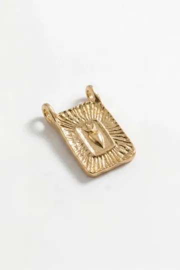
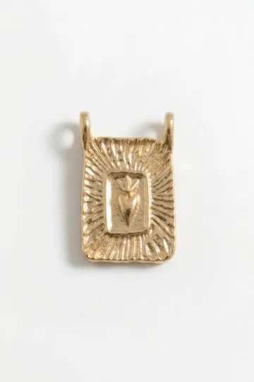
Jewelry with Arabic Calligraphy: Script, a Name in Arabic, and the Word as Treasure
When a letter takes the place of a portrait
In the Islamic tradition, depicting faces and figures in religious art is not the custom, and for centuries the written word stood where a portrait would. The calligrapher became what the painter was in other cultures, and a beautiful inscription carried the same weight as an icon or a family portrait. So a name or a word on an Arabic pendant is no mere ornament; it is the highest form of adornment, raised to the level of art.
This article is about how Arabic script lives in metal: which calligraphic styles exist and how to tell them apart by eye, what people most often write on pendants and rings, how a name is carried into Arabic spelling and why that is always an approximation, whether a non-Muslim can wear such a piece, and how to check an inscription before you buy so you never end up with a mirrored or broken line. No esoterica, no lecturing, straight to the point.
What Arabic script is and why it runs right to left
Before you choose a style and a word, it helps to understand the nature of the writing itself. Arabic graphics work differently from the Latin or Cyrillic alphabet, and those differences directly shape how an inscription looks in metal and why it is so easy to spoil during manufacture.
What Arabic script and Arabic calligraphy are
Arabic script is connected writing, where letters within a word join into a continuous line rather than standing as separate marks. Calligraphy is the art of beautiful writing, the set of rules by which a master builds each letter: the thickness of the line, the slant, the proportions, the spacing. In jewelry we almost always deal with calligraphy rather than a plain typeface, because the piece is small and the beauty of the line decides everything.
Why Arabic is written right to left
Arabic, like Hebrew, is read and written right to left. Historians link this to the ancient Semitic practice of cutting signs into stone: a right-handed carver held the chisel in the right hand and the mallet in the left, and moving from right to left was simply easier. For jewelry this matters in practice: if a maker who does not know the language set the text left to right or mirrored the layout, the inscription turns into nonsense, and only someone who can read will notice.
How letters change shape inside a word
The same Arabic letter looks different depending on its place in the word: at the start, in the middle, at the end, or standing alone. These are not four different letters but four forms of one. Because of this you cannot simply assemble a word from building blocks: each letter adapts to its neighbors, and the joins between them are part of the drawing. A good calligraphic pendant looks whole precisely because those transitions are done correctly.
Vowel marks and dots: small signs with big meaning
Above and below the letters, Arabic places tiny dots and short vowel marks. The dots distinguish letters that share the same base shape, and the vowel marks guide the reading. On a large inscription they are usually kept; on a miniature piece some may be dropped for a cleaner line. That is normal practice, but it matters that simplification never loses a dot that changes the letter itself, or the word will read as something else.
Where the tradition of writing as adornment grew from
Arabic graphics began with angular inscriptions on stone, and by the height of the Caliphate they had become a high art. Calligraphers were honored on a par with scholars, schools of writing kept lineages of masters, and the finest works were worth small fortunes. That thousand-year school is the reason a word on a piece of jewelry reads as something precious rather than as a fashionable engraving.
Wear the symbol, don't just read about it. These are in stock:


Calligraphic styles and how they look in metal
The phrase "Arabic calligraphy" gathers several schools of writing, and they differ as sharply as a printed typeface differs from a handwritten flourish. The choice of style sets the character of the piece: strict, ceremonial, airy, or geometric. Let us look at the five main styles and how each behaves in metal.
Naskh: calm and legible
Naskh is the basic standard script, the one used to set most printed text and the Quran. The letters are rounded, even, and easy to read. In metal naskh looks restrained and clear, and people choose it when the point is not flourish but clarity: a name, a short word, a verse that should read without effort. For a first calligraphic piece it is the safest style.
Thuluth: ceremonial and grand
Thuluth is a large decorative script with tall verticals and generous curves. It traditionally dressed headings, inscriptions on mosques, and book covers. In jewelry thuluth looks rich and festive, the letters interlace, the lines play. It is the choice for a statement pendant, when you want the inscription to read as a work in itself rather than as a signature.
Diwani: flowing and courtly
Diwani took shape at the Ottoman court as a chancery script. You recognize it by its strong slant, its dense weave, and lines that seem to pour into one another. Diwani is extraordinarily decorative and at the same time hard to read even for native speakers, so in jewelry people choose it for the beauty of the line rather than for legibility. In thin metal it is the most temperamental style: its tight joins fuse together easily.
Kufic: geometric and ancient
Kufic is the oldest angular style, with straight lines and square forms, named after the city of Kufa. Early Qurans were written in it, and it was carved into walls. Kufic sits beautifully in metal and in engraving precisely because of its straight lines: it is sturdier in fine work than the rounded styles and reads well even at small sizes. Modern designers love square Kufic for a graphic quality close to minimalism.
Nastaliq: hanging and poetic
Nastaliq is the Persian style, elegant, with letters that seem to dangle along a diagonal. Persian poetry was recorded in it, and it remains the main script for Farsi and Urdu. In metal nastaliq looks lyrical and graceful, its fine lines flowing from top to bottom. The style demands a master: its sloping tails are easily made too fragile in openwork cutting.
Customer reviews
Zevira is a real jewellery shop. Genuine payments, deliveries and customer thank-yous.
🥰🥰🥰 gracias
Ok, ¡gracias! 🙂
What people most often write on jewelry
The word on the script is not chosen by chance: behind every inscription stands meaning, from deeply religious to personal. Below are the most common choices and what they mean, so the decision is deliberate rather than picked at random for the beauty of the line.
A person's name
The most common request is one's own name, or the name of someone close, carried into Arabic spelling. People wear their own, and give a piece with the name of a child, a mother, a beloved. A name in script reads as a signature and as a charm at once: it is personal and at the same time beautiful as a drawing. How a name turns into an Arabic line, and why it is an approximation, is covered in detail in its own section below.
The word "Allah"
The word "Allah", the name of God in Islam, is among the most common on the jewelry of believers. It is treated with special reverence: such a piece is not worn in unsuitable places, for instance in the shower or the bath, and it is removed wherever other sacred things are removed. This is a matter of faith rather than a fashion motif, and it is chosen above all by practicing Muslims.
The Basmala
The Basmala is the opening formula "Bismillah ar-Rahman ar-Rahim", meaning "In the name of God, the Most Gracious, the Most Merciful". Almost every chapter of the Quran begins with it, as do many of a believer's actions. On a pendant the Basmala is a blessing for every day. Because of its length it is often set in dense thuluth or diwani, the line folded into a circle or a teardrop.
Verses of the Quran
Individual ayahs, verses of the Quran, are carried onto metal as protection and reminder. The most common is Ayat al-Kursi, the "Verse of the Throne", regarded as the strongest protective text in the Islamic tradition. Ayahs are long, so they are usually engraved on a plate or coiled into a spiral rather than cut as openwork. The text of the Quran on the body is treated strictly, and such a piece should be worn with respect.
"Mashallah" and "Inshallah"
"Mashallah" means "God has willed it" and is said in admiration and as protection from the evil eye, especially when praising a child or beauty. "Inshallah", "if God wills", is said of the future. Both phrases are short, sit well in a pendant, and are popular as kind protective words, gentle in meaning and clear even outside a religious context.
The ninety-nine names of Allah
In Islam, God has ninety-nine beautiful names and epithets: the Gracious, the Merciful, Peace, Light, and others. Individual names are chosen for the meaning closest to a person, and worn as a short word. Sometimes sets or bracelets are made where the names run around in a circle. This is a deeply religious choice, and each name carries its own meaning.
A protective phrase against the evil eye
Besides "Mashallah", people write short protective formulas and invocations against the evil eye, and combine an inscription with protective symbols such as the Hand of Fatima. The idea is the same as in many cultures: a word or a sign turns aside another's ill-natured envy. More on the pairing of script with protective charms follows below in the section on the nazar and the hamsa.
A favorite word, a motto, or a line of verse
Not everything in script is religious. People often order a word like "love", "freedom", "patience", "light", a line from Persian poetry, or a personal motto. Such an inscription is an adornment with meaning and no confessional context, and people of all views wear it comfortably. Poetry looks especially fine in nastaliq, its native style.
A date, an initial, or a short mark
Besides words, people carry a meaningful date in Arabic numerals onto metal, or a single initial, or a short two-letter monogram. This is the compact option for a ring or a small pendant, where a long line simply will not fit. For anyone wavering between an Arabic letter and a familiar Latin one, the guide to initials and monograms is useful: the principle is the same, the graphics differ.
Two words or two names together
Sometimes a single piece joins two meanings: a name and a protective formula, the names of two people, a word and a date. Here composition matters: the calligrapher arranges the lines so they read in turn and do not crowd each other. Overloading a small pendant with three inscriptions is unwise, or the letters grow tiny and the joins become fragile.
Turn on your camera, pick earrings, a pendant or a ring, and see the piece on yourself in real time.
Switch items in one tap.
Everything runs in your browser: no photo or video is ever uploaded.
A name in Arabic: transliteration and why it is an approximation
Carrying a name into Arabic script is harder than it seems. The Arabic alphabet does not convey every sound of other languages, and any name comes out slightly altered. Understanding this before you order matters, so you are not later disappointed in the result.
What transliteration of a name is
Transliteration is writing the sound of a name with the letters of another alphabet. The name is not translated by meaning but rendered by ear: "Anna" becomes a sequence of Arabic letters giving a close sound. The result is not a "real Arabic name" but the Arabic spelling of your name, and that is normal, that is exactly how it is done.
Why the sound comes out approximate
Arabic lacks certain sounds familiar to other languages, such as a hard "p", "v" as in "voice", or "g" as in "go", and it has sounds that other languages lack. So "Peter", "Victor", or "Grace" are rendered by the nearest letters in sound, and the result is slightly shifted. This is no fault of the maker but a property of the language: an exact match often simply does not exist.
The short vowels that are not written
In ordinary Arabic writing, short vowels are not shown by letters; they are implied or marked with tiny vowel signs. Because of this, the same spelling of a name can be read in slightly different ways. If unambiguous reading matters, ask for the vowel marks to be added; the line then grows a little more complex, but the sound is fixed more precisely.
Several correct spellings of one name
Many names have not one correct Arabic form but several, because different traditions render sounds in their own way. This does not mean one is right and the other wrong. Choose a version in advance and agree it with the maker as a finished line, rather than leaving it to a random generator.
How to check before you order
The best safeguard is to show the chosen spelling to a native speaker or a specialist and ask them to read it aloud. If the person says your name recognizably without prompting, the version works. The same trick helps with a name in Latin initials when you are choosing between Arabic script and a familiar monogram.
Cultural and religious meaning: wearing it respectfully
A calligraphic piece often carries a religious text, and the way it is treated differs from an ordinary accessory. These are not prohibitions for their own sake but the normal culture of handling the sacred, useful for anyone who wears or gives such a piece.
Sacred text as a holy thing, not decor
The word "Allah", verses of the Quran, and the names of God are sacred to believers, not graphics. They are not tossed about, dropped, or worn into the toilet or the bath. Many remove such jewelry wherever they would not keep other sacred objects. If you are giving such a piece, it is fitting to know this and not treat it as an ordinary trinket.
Whether a non-Muslim can wear such a piece
There is no outright ban on a non-Muslim wearing Arabic calligraphy, and many take it calmly, as an interest in culture. The question is what exactly is written. A name, a line of poetry, a neutral word like "love" or "peace" rarely cause concern. With openly religious text it is more delicate: its appropriateness depends on whether you are ready to wear it with the same respect a believer would.
Delicacy with openly religious text
If you are not a Muslim and you are drawn specifically to the word "Allah", the Basmala, or an ayah, it is worth asking yourself honestly whether you wear it as a holy thing or as decoration "inspired by". Many feel the sacred text is better left to those for whom it is part of faith, and choose instead a name, a motto, or a verse. This is no strict rule but a matter of tact.
A gift: ask, do not guess
A calligraphic piece is one of those gifts where it is better to learn the recipient's wishes in advance. A religious person cares about the right word and correct spelling; a non-religious one may prefer a name or poetry. Guessing the content of the inscription is risky: a piece with meaning is valued when the meaning was chosen deliberately, not at random.
Respect without lecturing, both ways
You can wear another culture's tradition with interest and tact, and most who hold it value that. The point is not to turn the sacred into pure decor and not to pretend you understand more deeply than you do. A simple, honest approach, learn the meaning, choose a fitting word, handle it carefully, settles almost every question.
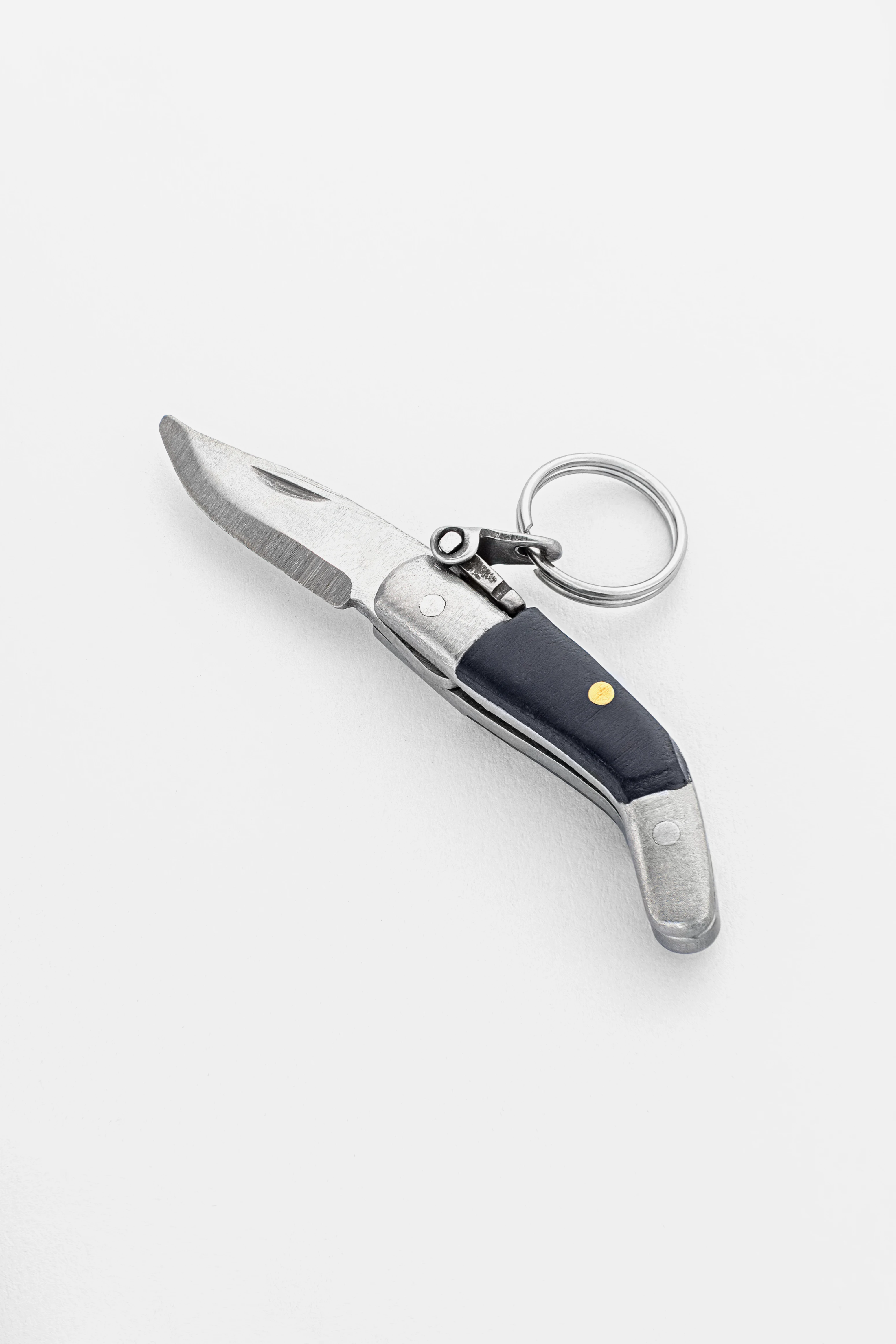
Artisan-crafted CAPAORA navaja pendant
A 40 mm stainless-steel navaja with a real folding mechanism and Palanquilla lock. An affordable gift to remember.
A code for blog readers:
10% off your first order
Authentic · Maker's guarantee · Ships from Spain
The evil eye and Arabic protective charms
Protection from the evil eye is a theme shared across the whole Middle East and the Mediterranean, and calligraphy often sits beside protective symbols. Let us look at what turns aside the evil eye in the Arab world and how it combines with an inscription.
The evil eye in the Arab tradition
The evil eye, in Arabic "ayn", is the idea that another's envy or ill-wishing admiring glance can do harm. That is why people say "Mashallah" in admiration: to praise without casting the eye. Protection from the ayn is woven deep into daily life, and a protective piece here is part of the culture rather than a superstitious trifle, understood from Morocco to the Gulf.
The Hand of Fatima (hamsa)
The hamsa, also the Hand of Fatima, a palm with symmetrical fingers, is one of the chief charms of the Arab and Mediterranean world. It is worn on its own and paired with an inscription: the palm as a shield, the word as meaning. For its meaning and history in full, read the separate guide to the hamsa; here what matters is that the hamsa and calligraphy are frequent neighbors on a single pendant.
The "nazar": the blue eye in the Arab world
The blue eye bead, known as the nazar, came from the Turkic and Mediterranean tradition but took root across the Arab world as protection from the ayn. It is combined with the hamsa and with an inscription, adding a blue eye to a pendant with a name or "Mashallah". The result is double protection: symbol and word together.
Ayat al-Kursi as protection
Ayat al-Kursi, the "Verse of the Throne", is for believers the strongest protective text of the Quran. It is recited before sleep and worn on a plate pendant as a charm. Because of its length it is usually engraved rather than cut as openwork, and often on the back of the piece so the text sits closer to the body. This is a deeply religious charm, chosen above all by the practicing.
Word and symbol together
The strength of the Arab tradition is that word and sign work as a pair. "Mashallah" beside a hamsa, a name with a blue eye, the Basmala on an openwork rosette: the text carries the meaning, the symbol amplifies and adorns. This gives huge freedom in design and explains why calligraphic charms are so varied. Anyone drawn to pure symbolism without text should look into the guide to protective amulets and talismans.
Leave your email, we'll send your discount code. No spam, unsubscribe anytime.
The code arrives by email, valid on your first order.
Materials: gold, silver, and the strength of fine script
Calligraphy in metal is a challenge to the craft: the letters are thin, the joins fragile, and the piece is worn every day. The material decides whether the inscription survives the years. Let us look at what such jewelry is made from and what matters for durability.
Gold: the traditional choice
In Arab culture gold is a metal of status and affection, and calligraphic pendants are most often gold. Yellow gold is warm and dressy, and it holds fine openwork script well, especially in the higher karats. To get a grip on shades and alloys, the guide to white, yellow, and red gold is useful: the tone of the metal noticeably changes the mood of the inscription.
Silver: more accessible and versatile
Sterling silver 925 is a good choice for anyone who wants calligraphy without a gold budget. It is stronger than the pure metal thanks to the alloy, holds cutting and engraving well, and gives a noble cool tone. There is one drawback: silver darkens over time, and patina builds faster in the recesses of the script, so caring for the openwork matters more than with gold.
Steel and warm alloys
Stainless steel barely darkens, is hypoallergenic, and is cheap, so everyday calligraphic pendants are made from it, especially by laser cutting and engraving. Warm alloys and gilded silver give the look of gold for less money, but the plating on fine script needs careful handling: worn gilding on the letters shows at once.
Openwork cutting of the letters
The most striking technique is to saw or cut the letters all the way through, so the word reads against the light. It is beautiful, but here lies the fragility: the thin joins and tails of the letters become the weakest spot. The more "hanging" the style (diwani, nastaliq), the higher the risk that the openwork bends or cracks. An experienced master reinforces the vulnerable places or chooses a sturdier style.
Engraving versus cut-through openwork
The alternative to openwork is engraving on a solid plate: the letters are cut not all the way through but into the thickness of the metal. This is how long texts are made, ayahs and the Basmala, where cut-through work would simply fall apart. Engraving is stronger and cheaper, openwork more striking and airy. The choice depends on the length of the text, the style, and how often the piece will be worn.
Depth, relief, and reading the inscription in the light
Calligraphy is made flat, in relief, or blackened in the recesses, and this decides how it reads. Relief letters catch the light along their edges and are visible from a distance. Blackened recesses raise the contrast on silver, and the line stands out more clearly. Flat laser engraving is cheaper but reads worse in dim light. For everyday wear people choose relief or blackening: they hold legibility even when the piece has dimmed a little.
Metal thickness and the durability of the line
For fine script both the karat and the thickness of the blank matter. A plate too thin under openwork bends, and the letters deform from ordinary wear. A master allows extra thickness in the vulnerable places, especially on hanging tails and narrow bridges. Asking about thickness is as fitting as asking about karat: it decides whether the inscription survives years against the body.
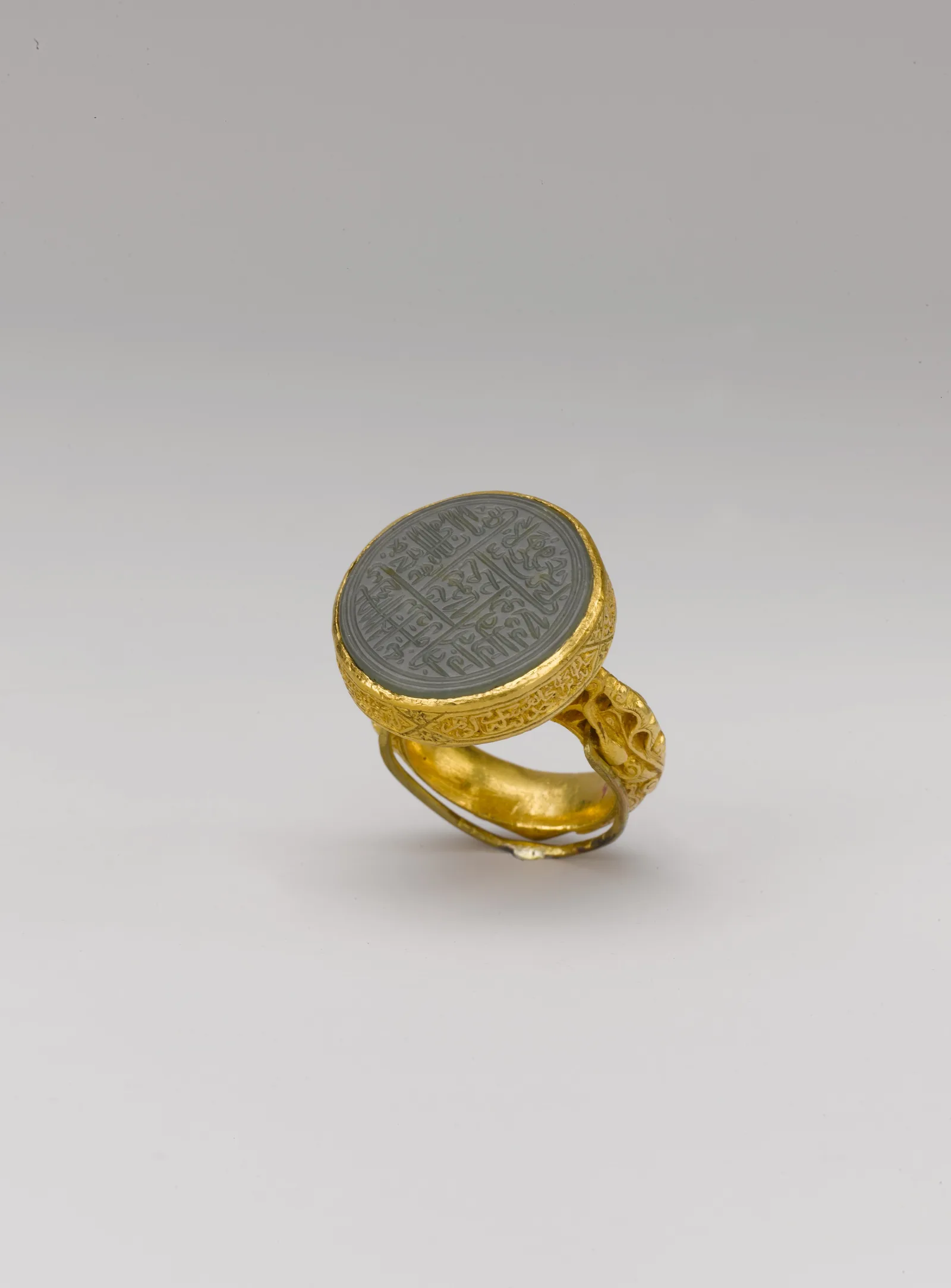
How to read and check an inscription before you buy
An error in an Arabic inscription is not rare, especially with sellers who cannot read Arabic themselves. A mirrored line, broken joins, swapped letters turn up often. A few simple checks will save you from disappointment.
Mirroring: the first and most frequent error
The most common trouble is mirrored text, where the layout was flipped during production or assembled left to right. By eye it shows like this: a connected Arabic word suddenly falls apart into separate marks, because the letters join incorrectly. Compare the photo of the piece with a reference spelling of your word, ideally one sent by a native speaker.
Letters broken out of their joins
If letters within a word stand apart where they should connect, the inscription was either set in an unworkable font or assembled from separate forms. A connected word in naskh or thuluth should flow in an unbroken line. Visible gaps between letters of one word are a warning sign: most likely the inscription was put together without skill.
Swapped or lost dots
Many Arabic letters differ only in the number and position of their dots. A dot lost during simplification turns one letter into another and changes the meaning of the word. Check that the small dots are in place and that there are as many as there should be. This matters especially on miniature openwork pendants, where details get lost.
Checking with a native speaker
The golden rule: before payment, show the photo or the layout to someone who reads Arabic and ask them to read it aloud. If the person says your word or name correctly without prompting, the inscription works. This step takes a minute and closes almost every risk, including mirroring and broken joins.
Where sellers' errors come from
Errors are usually not ill intent but carelessness: a designer who does not know the language takes an image from the internet, flips it for the sake of the composition, or copies someone else's faulty layout. So it is safer to order calligraphy where the layout is prepared or proofed by someone who knows the language, and where they send you the spelling for approval before manufacture.
How to wear it and whom it suits
A calligraphic piece is universal in form, but it has its nuances of fit and pairing. Let us look at how to wear an inscription beautifully and whom such a piece suits best.
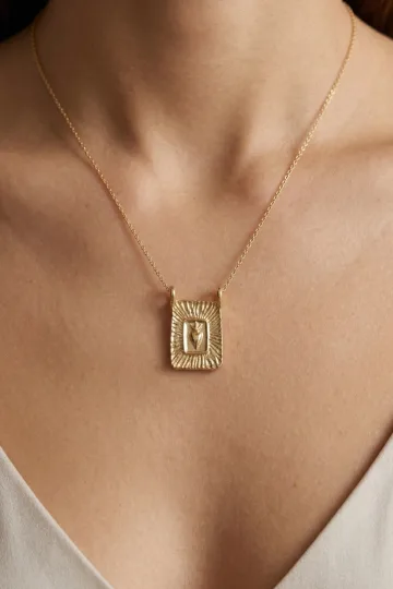
A pendant for every day
Most often the script lives in a pendant on a chain. A short word or a name looks good at medium length, near the collarbones, where the inscription reads. A long text on a large plate asks for a longer chain and a more open neckline. To choose the length, the general principle of pendant fit helps: the larger and more textured the pendant, the more "air" it needs.
A ring or a bracelet with an inscription
A name or word engraved around the band of a ring or on the plate of a bracelet is a restrained option for those who dislike an accent on the chest. On a ring the text is usually short because of the size; on a bracelet plate a longer line fits. Kufic and naskh read best on such surfaces thanks to their even lines.
A pair and a family story
Calligraphy is loved as a sign for couples and families: the names of two people on two pendants, a child's name for the mother, a family word. The meaning sewn into the letters makes such a piece a personal heirloom, passed onward. It is a strong choice for a gift at a birth, a wedding, or an anniversary.
Whom a calligraphic piece suits
It suits those who value meaning in a piece: believers who wear the word as part of faith; people with Eastern roots, for whom it is a link to culture; and anyone drawn to the idea of "wearing a word, not a picture". Gender and age play no role: only the style, the weight, and the length of the inscription change.
How to pair it with other jewelry
A calligraphic pendant pairs easily with protective symbols: the hamsa, the blue eye, the crescent. In layers it is kept as the center of meaning, with the rest chosen quieter so the inscription stays legible. With bright stones it is better not to overload the script: the text is a strong accent on its own, and competition for attention does it harm.
Send a friend a discount code, they save on their first order.
Caring for openwork and fine script
A fine inscription asks a little more care than a smooth piece: dirt builds in the recesses, silver darkens, openwork fears knocks. A few habits will extend the piece's life and keep the line legible.
Cleaning the inscription without harm
The best tool for script is a soft toothbrush and warm water with a drop of mild soap. The brush reaches the dirt in the recesses between letters, where a cloth cannot. Move gently, along the lines, then rinse thoroughly and pat dry. Abrasive pastes and stiff brushes on openwork are off limits: they wear away the edges and the plating.
Silver darkening in the recesses
On silver script, patina in the recesses is often a plus: the dark hollows make the letters more pronounced and legible. If the darkening is excessive, a special silver cloth helps on the raised areas, while the hollows are left as they are. There is no need to whiten the openwork completely, or the letters will "merge" and lose contrast.
Protecting the fragile joins
The weakest spot is the thin bridges between letters and the hanging tails in diwani and nastaliq. They are easy to bend by catching on clothing or tossing the piece into a shared box. Store calligraphy separately, in a soft pouch, and remove it before sport, sleep, and any work with the hands if it is a ring or a bracelet.
Water, cosmetics, and plating
Remove a calligraphic piece in the shower, the pool, and the sauna: water, chlorine, and sweat speed the darkening of silver and the wearing of gilding on the letters. Apply perfume, creams, and hairspray before you put the piece on, not after. For religious inscriptions this rule coincides with the tradition of removing a sacred thing in unsuitable places.
When to take it to a master
If an openwork join has cracked or the tail of a letter has bent, do not straighten it yourself: thin metal breaks at the fold. A jeweler will carefully solder or straighten the part and, if you wish, reinforce the weak spot. A regular professional cleaning once a year will bring legibility back even to badly darkened silver script.
Facts that surprise
Arabic calligraphy has gathered remarkable stories for more than a thousand years. A few facts that change how you see the inscription hanging at your neck.
Writing became an art because of the rule on faces
Since living beings were not depicted in religious art, all the creative energy went into writing. The calligrapher took the place the painter held in Europe, and a beautiful inscription became what a portrait or an icon was in other cultures. So the letter grew into a high art, and the word on your pendant is the heir of exactly that tradition.
Whole pictures are built from a single phrase
There is zoomorphic and figurative calligraphy, where the letters of one phrase are arranged into an image: a bird, a lion, a face, a ship. From afar it is a drawing, up close it is text. For centuries masters competed over who could fit a sacred line into the most unexpected silhouette, and this game of "a picture from words" is alive to this day.
Kufic is stronger in metal than the rounded styles
Angular Kufic with its straight lines holds fine cutting better than the "flowing" styles: a straight bridge has more reserve of strength than the curved hairline of diwani. So the most ancient-looking style turns out the most practical for modern laser cutting and openwork. Here the archaic and the technological coincide.
A vowel mark can change the meaning of a word
Because short vowels are not written, the same chain of letters reads differently depending on the vowel marks. The classic example from schoolbooks: without the signs a word is ambiguous, with them it is unambiguous. So on important inscriptions the vowel marks are added on purpose, to fix the single correct reading.
"Mashallah" protects not by magic but by courtesy
Behind the formula "Mashallah" stands a social mechanism: to praise a person or a child without stirring envy, giving the admiration to God. It is not a spell but a cultural habit of tact, built into the language. When you wear "Mashallah", you wear not a pure amulet but also a small lesson in courtesy.
Nastaliq was invented to record poetry
The hanging Persian nastaliq was born of the need to record poetry beautifully, and its lines literally "pour" along the diagonal, the way a verse flows. So an inscription in nastaliq on jewelry almost always reads as lyrical: the very form of the writing is shaped for poetry, not for documents.
Frequently asked questions
Can I wear Arabic calligraphy if I am not a Muslim?
Yes, there is no outright ban, and many take it as an interest in culture. The question is the content: a name, a line of poetry, or a neutral word like "love" rarely cause concern. With openly religious text, the word "Allah" or an ayah, be more delicate: wear it only if you are ready to treat it with the same respect a believer would.
How do I write my name in Arabic?
A name is not translated but rendered by sound in Arabic letters, which is called transliteration. The result is the Arabic spelling of your name, not a "new name". Because of the difference in sounds it comes out as an approximation, and one name may have several correct versions. Choose a version in advance and agree the finished line with the maker.
Why is Arabic written right to left?
It is an ancient Semitic tradition going back to cutting signs into stone, where moving right to left was easier for a right-handed carver with a chisel. For jewelry this matters in practice: if the layout was accidentally flipped or assembled left to right, the inscription becomes unreadable, and only someone who can read will notice.
How do I check that an inscription on a piece has no errors?
Before payment, show the photo or layout to someone who reads Arabic and ask them to read it aloud. Check that the letters within a word connect continuously, that there is no mirroring, and that all the dots are in place. A connected word should flow as one line; separate marks and gaps are a sign of an unskilled layout.
Which calligraphic style should I choose for a pendant?
For a clear, legible inscription take naskh; for a ceremonial accent, thuluth; for graphic minimalism, square Kufic. Diwani and nastaliq are the most decorative but also the most fragile in thin metal. If the piece will be worn every day and the strength of the openwork matters, Kufic and naskh are the most reliable.
Which metal is best for ordering calligraphy?
Gold is traditional and holds fine script well; sterling silver 925 is more accessible and versatile but darkens in the recesses and needs care; steel barely darkens and suits everyday wear. For long texts like an ayah choose engraving on a plate; for a short word, striking cut-through openwork is possible.
How is engraving different from openwork cutting?
In openwork cutting the letters are sawn all the way through and read against the light, which is airy and striking, but the thin joins are fragile. In engraving the letters are cut into the thickness of a solid plate, which is stronger and cheaper and suits long texts. A short name is beautiful in openwork; an ayah or the Basmala is safer in engraving.
How do I care for silver script so it does not blacken?
Clean it with a soft toothbrush and warm water with a drop of soap, along the lines of the letters, then rinse and pat dry. Light patina in the recesses is better left, as it makes the letters more pronounced; remove excessive darkening with a silver cloth on the raised areas. Take the piece off in the shower and apply cosmetics before you put it on.
Silver, gold, steel, symbolism with a history, and jewelry with meaning you can wear every day.
About Zevira
Zevira is a Spanish brand from Albacete, a city of metalworkers. We love pieces with character and meaning: symbolism with a history, inscriptions, warm metals, and silver. If protective symbolism is closer to you, start with the guide to the hamsa, the Hand of Fatima, and for the shades of metal under an inscription, the breakdown of white, yellow, and red gold will help.