Colour echo: matching jewellery to what you wear
Why jewellery and clothing argue about colour
Two centuries ago a chemist at the Gobelins dyeworks examined weavers' complaints that the black came out weak, and proved the dye was faultless: the neighbouring threads were to blame. Jewellery obeys the same law. A silver chain dies on a cream blouse just as a gold one does. What vanishes is the metal that matched the cloth in lightness.
A piece of jewellery has no colour of its own
Michel-Eugène Chevreul took charge of the dyeworks at the Gobelins tapestry manufactory in 1824 and was met with a complaint aimed at his own shop: the weavers said the black wool came out weak and lost its depth in the finished tapestry. The dyeworks was the accused party, not a fellow plaintiff, and it fell to its new director to answer for the fault. He tested the dye and found nothing wrong. The same batch looked deep in the skein and only faded once it sat in the weave.
So Chevreul stopped looking at the dye and started looking at the threads around it. His own observation became the key: next to blue the same black takes a reddish cast, next to yellow it reads differently again. A complaint about pigment was really a description of an optical effect, and in 1839 he published his book on the law of simultaneous contrast. The rule holds for a tapestry, a dress, and a pendant alike. A piece of jewellery carries no colour settled in advance of the clothing beside it.
Lightness decides before hue does
Colour splits into three measures: hue, lightness, and saturation. Albert Munsell laid out that system early in the twentieth century, and it still explains why some pairings hold. Hue is the colour itself, lightness is how near it sits to white or black, saturation is how pure it is against grey. The three move independently, so one green can be pale and muddy or dark and ringing without changing hue.
A piece goes missing not when the hue is wrong but when it matches the cloth in lightness. Pale yellow gold disappears on a cream blouse, and a fine silver chain disappears there just as fully: both metals are light, the ground is light, no gap is left for the eye to catch. A dark onyx in a thin setting turns to a shadow on a black jumper. In all three the temperature is fine, and the piece still cannot be seen.
From that comes the order this article follows. First the lightness gap: is the piece lighter than the ground or darker. Second temperature: warm metal to warm cloth, cool to cool. Third the colour echo: does that colour turn up in the look a second time. The sequence runs this way because a piece that has merged with the cloth in lightness will not be saved by an exact stone or a clever echo. It simply will not register. Lightness answers whether the piece is seen at all. Temperature answers only how it reads, as a continuation of the cloth or as a separate voice.
Echo and contrast: the two working strategies
An echo means the colour of the jewellery repeats a colour already in the clothing: a green stone to a green stripe in the shirt, warm brass to oatmeal linen. The look settles, the eye travels a loop and never trips.
Contrast sets the jewellery against the ground: cool silver on terracotta, a red carnelian on grey. The eye catches on one point and the piece reads as an accent. The trouble starts when both strategies land in one look, half the pieces echoing and half arguing. Then there is nothing for the eye to fix on, and a person who checked every piece separately still looks thrown together in the mirror.
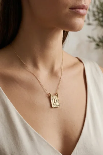
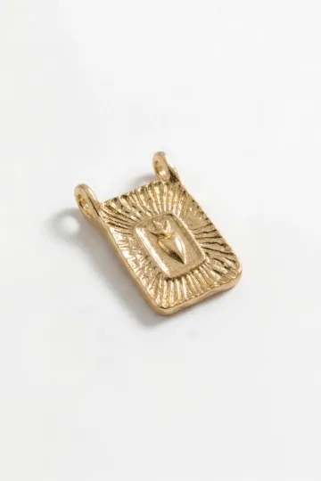
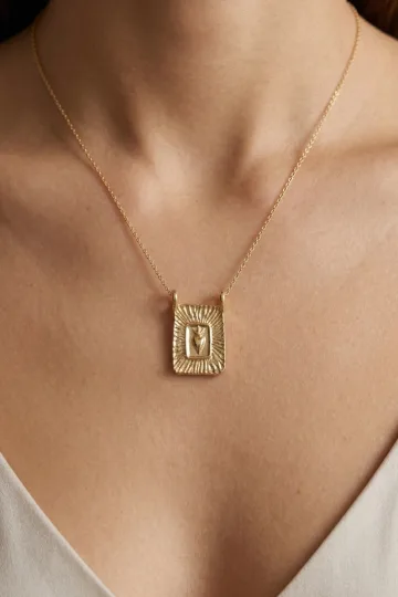
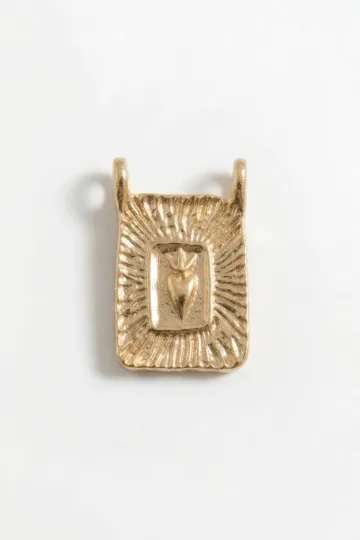
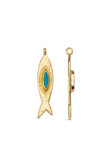
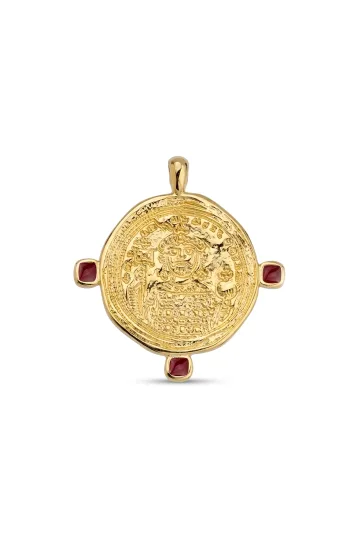
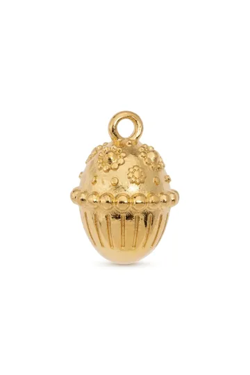
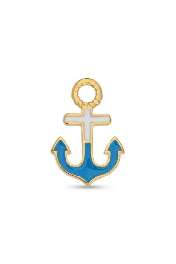
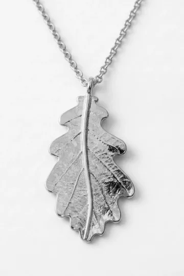
Wear the symbol, don't just read about it. These are in stock:
Metal against the colour of the cloth
Metal runs through a piece even when it holds no stone, in the chain, the setting, the clasp, so the link to clothing is easiest to work through it. The order stays the same: lightness first, then temperature.
Yellow metal and the warm half of the wardrobe
Yellow gold, brass, and bronze carry a reddish note: pure gold is yellow by nature, and copper alloys push it warmer still. This metal sits well with anything on the warm side of the room: ochre, mustard, terracotta, camel, chocolate, olive and its cousin khaki, brick, and the whole family of linen and unbleached cotton.
Warm cloth throws warm light back onto the metal, and the gold does not argue, it glows. A yellow chain looks richer on a mustard jumper than on a white tee, though it is the same chain. The reverse holds too: with no warmth in the clothes, yellow metal wants support from a brown bag or the leather strap of a watch.
One caveat comes straight from the first rule. A match in temperature does not cancel a match in lightness, and on pale warm cloth the two coincidences stack. On sand, camel, and ochre a small yellow piece meets the ground in both warmth and lightness at once, and it is that piece which drops out, while cool silver beside it stays crisp because it differs in temperature at least. Volume rescues it, or a dark stone, or an oxidised surface. On mustard, terracotta, and chocolate the cloth is darker than the metal, and the gap arises on its own.
White metal and the cool half
Silver and white gold return light evenly and without yellow, and rhodium, the thin skin they are plated with, adds a cool clarity and guards silver against tarnish. Steel keeps the same company but needs no rhodium: it is white on its own account, the chromium in the alloy giving an even grey shine with no warm note. Hence the difference in care: rhodium plating wears thin on rings and wants renewing, while a steel surface simply scratches and is polished back.
The cool half of the wardrobe is blue in every form, lavender, mint, emerald, plum, cool pink, and the optically brightened white with its bluish cast. On the dark part of that half, on indigo, graphite, and emerald, white metal reads as a continuation of the cloth and shows beautifully all the same: the ground works for it.
The caveat mirrors the last one. On pale cool cloth, on blue poplin, light grey cashmere, or mint silk, white metal meets the ground in both temperature and lightness, and a fine silver chain there is lost exactly as a gold one is on sand. The same chain on navy reads perfectly. The reverse is a tool, not a fault: yellow metal on cool cloth differs in temperature and steps forward. And if white metal is wanted on a warm ground, volume saves it: a thin chain on terracotta drops out, while a wide cuff holds attention by mass.
Rose gold and its narrow lane
Rose gold is an alloy with a raised share of copper, and its colour sits between the two camps. Hence its reputation for being temperamental: it drifts warm beside beige and cool beside grey, changing character with the clothes more than yellow or white do.
In practice it looks best on dusty, muted colours: rose-grey, powder blue, warm grey, coffee, wine. It struggles next to a clean bright red or orange, where it looks washed out, and next to a cold blue, where it reads as a stray note. How two-tone and three-tone pieces work, where such a metal sits beside white, is set out in the guide to bimetallic jewellery.
The neutral base that takes any metal
Some clothing colours settle the metal question on their own. The list is short and closed: deep black, mid grey, navy. They own no temperature, or it is balanced inside the colour itself, so they hold yellow and white with equal honesty. Mid grey shows this best: silver on it looks composed, gold looks warm, and neither argues with the ground. All three are dark enough, too, that the lightness gap is cleared for free.
Khaki does not belong on this list, though it is often filed there. Khaki and olive are one family with an earthy yellow-green base, and they behave like warm cloth: yellow metal echoes, white steps forward as an accent. So this article keeps them on the warm side.
White is less at home here still, though people most eagerly call it neutral. White cloth splits into cool and warm, and the metal depends on which it is more than on any other ground. That case has its own section below: a white shirt behaves not as a neutral field but as a coloured one, and the lightest that clothing comes.
On such a base a trick opens up for anyone short of jewellery. Build the everyday wardrobe from these colours, and a single chain covers a week with no caveat. Colour then enters in small doses: a scarf, a shirt, a bag. That is how a sensibly built wardrobe runs, rather than buying a fresh piece for every shade.
People turn up with their skin undertone memorised and a cream shirt on their shoulders. The undertone you settled once; the shirt goes on every morning, and it is the shirt the pendant is fighting. A thin chain on cream, never. Only large or dark holds there, and I will not be argued with.
The stylist's read: build colour in three moves
The colour of clothing changes by the day, while the box of jewellery stays the same, and it is on that seam that looks fall apart. Here is a conversation with a Zevira stylist about the order in which to make the decisions, so as not to buy a new piece for every new garment.
Where do you start when you match a piece to a specific garment?
With lightness, then temperature. First I look at whether the cloth is lighter than the piece or darker, because the lightness gap decides whether the piece is seen at all. Once the gap is there, I ask about warm and cool and choose between yellow and white metal, remembering that this choice is not about visibility but about the part it plays: warm metal on warm cloth gives an echo, cool metal on the same cloth gives an accent, and both answers are honest. Third comes the echo: does the colour of the piece turn up again, in a scarf, a buckle, the lining of a cuff. The shade of the stone I settle last: it is the smallest of them, and in the whole picture it weighs less than the metal and the size.
How do you choose between an echo and a contrast?
I look at how much colour the clothing already holds. If someone is in one quiet colour, I advise contrast, so a point appears. If the clothing has two colours or more, I build an echo and repeat the one that shows up least. A rule worth keeping: the busier the clothing, the plainer the jewellery, and the other way round.
Which colour of clothing is the hardest for jewellery?
A saturated colour of middling lightness: fuchsia, electric blue, bright red, emerald silk. It is neither dark nor light, it gives almost no lightness gap, and it sounds loud all the same. Metal looks pale against it, a stone competes and loses. I suggest not matching colour at all here, but choosing a piece with a bold form and a polished surface: it holds on shine rather than hue. The second move is to take the jewellery off the body onto the hands and ears, where the ground becomes skin, not cloth.
Is bag and shoe hardware really that important?
It is, and it is noticed last. A belt buckle, the zip on a bag, the trim on a boot, that is metal already on the person, only below eye level. When I build a look for going out, I bring the jewellery to that metal, not the other way round. Bags and shoes are changed less often than jewellery, so it is cheaper to adjust with the box.
Which mistake do you see most?
A piece that matched the clothing in lightness. Someone picked the right shade, put it on, and saw nothing in the mirror. I always advise stepping back from the mirror and looking again, no longer studying the detail. It shows at once whether the piece is on the person or not, and no theory of colour will replace that.
What would you tell someone with a busy wardrobe?
Gather three key pieces: one yellow, one white, and one with a stone of a neutral colour, smoky quartz or onyx. That set covers nearly any clothing, and beyond it you should buy only for what you wear every week. Buying a piece for a dress worn once a year is something I talk people out of every time.

Turn on your camera, pick earrings, a pendant or a ring, and see the piece on yourself in real time.
Switch items in one tap.
Everything runs in your browser: no photo or video is ever uploaded.
Black clothing and metal
Black runs through every wardrobe, and it is the most deceptive ground of the lot.
Why almost any metal wins on black
Black cloth soaks up light and returns almost none, so any shine on it takes the widest possible lightness gap. Metal comes forward with no effort, which explains the durable habit of reaching for jewellery to wear with black.
The generosity has a price. Since the ground sets no temperature, the piece is left alone with the face, and the burden shifts onto skin and hair. A black dress forgives the choice of metal but ruthlessly shows the choice of length and size: on an empty field everything is visible. That is why black takes either one clear piece or a stack matched in tone, not a random handful.
Silver on black draws a line
White metal on black works like a stroke of pen on paper. The outline of a chain, the edge of a ring, the facet of a pendant read cleanly, and form matters more than colour. The pairing suits any moment that wants composure: a formal evening, a shoot, a talk where added warmth would be wrong.
There is a consequence for shape. On black a piece with a clear silhouette wins: geometry, a clean line, a smooth surface. A fine scatter or a lacework of metal turns to noise, because the eye reads the overall patch and the detail never reaches it.
Yellow on black gains weight
Yellow metal on black does not draw, it glows. A warm patch on a dead ground reads as a source of light, so even a small pendant gathers visual weight. Hence the rule of restraint: with yellow metal, wear fewer pieces than you would in white.
There is a pairing people forget: black with oxidised silver. Metal darkened by patina all but disappears on black cloth, yet comes alive on beige, grey, and pale denim. Such a piece is worth planning for a light top rather than a black hem, or it will simply go unseen.
The white shirt and metal
A white shirt looks like a blank sheet, until it turns out there are many whites, and the sheet is lighter than any piece of jewellery.
Lightness first: nothing is lighter than the field
A white shirt is the lightest ground a person is likely to wear, so the first step weighs more here than on any other cloth. Polished light metal on white cotton walks up to the edge past which a piece stops reading, and from both sides at once: a fine chain is lost on white in gold and in silver alike. Temperature has nothing to do with it, there is simply no gap to be had.
Four things rescue it, and all four are about lightness. Volume, because mass gives a piece its own shadow. A dark stone, which brings a black point with it. Oxidising and patina, which push the metal into the dark zone. And polish as a last resort: a mirror surface catches a highlight and traces an outline even where the piece met the cloth in lightness. A matt light piece on a white shirt loses every time, and that is the one flat prohibition here.
White is not one colour: temperature sets the role
White cloth divides into cool and warm. Optically brightened cotton with its bluish cast is cool, while cream, vanilla, ecru, and unbleached linen are warm. The difference shows if two whites are laid side by side, and it settles not whether the piece is seen but the part it plays.
On cool white, silver sounds like a continuation of the cloth, while yellow gold turns into a warm point and reads as an accent. On cream and ecru it is the mirror image: gold slips into an echo, silver steps out as a cool note. None of the four is a mistake, the only question is whether you want agreement or a voice from the side. And none cancels the earlier step: a small light piece is not saved by either role, first it needs volume or a dark detail.
An open collar changes length, not metal
The collar sets geometry, not colour. Buttoned to the throat, a shirt asks either for a short piece at the neck or a long one worn over the cloth. One open button opens a wedge, and into it a pendant that ends above the edge of the opening fits well.
The metal stays the one you chose for the shade of white. Mixing the two questions does harm: people swap gold for silver when what they really need to change is the length of the chain. How different necklines dictate the shape and set of a piece is worked through in the guide to jewellery for every neckline.
Buttons and cufflinks are a ready-made cue
A shirt already has metal, and it goes unnoticed. Buttons come in mother-of-pearl, matt white, black, and a cuff may carry cufflinks. All of that lands in the frame with the chain, even when it sits on the wrist rather than the chest.
So look at the buttons and cufflinks first, and choose the jewellery to suit them. Mother-of-pearl asks for white metal, dark horn and wood pull towards yellow. If the cufflinks are already gold, it is wiser to carry the line on than to set silver beside it and tell yourself it was meant.
Customer reviews
Zevira is a real jewellery shop. Genuine payments, deliveries and customer thank-yous.
🥰🥰🥰 gracias
Ok, ¡gracias! 🙂
Denim, knit and the texture of cloth
Cloth returns light in its own way, and that decides whether a piece will shine or lie as a matt patch.
Indigo wears off, and jewellery feels it
Indigo settles on a cotton thread in a particular way: the dye sits on the surface of the fibre and barely soaks in. So denim fades along the seams and folds, laying bare the white core of the thread. Out of one cloth, time makes two different grounds.
Dark raw denim behaves close to black: deep, and it takes any metal gladly, because the lightness gap is huge. Then the role decides: yellow metal carries the line of the rivets and reads as part of the garment, white runs against it as an accent. Faded light denim turns greyish and muted, the lightness gap is small, and there size wins over temperature. A piece that lay beautifully on new jeans can look lost on old ones.
The copper and brass came from the jeans themselves
Jeans have a metal of their own, and it is no accident. On 20 May 1873 a United States patent, number 139,121, was granted for reinforcing the corners of pockets with metal rivets, drawn up as protection for the seam rather than as ornament, and from then on copper rivets and yellow buttons became part of the garment.
So denim is friendly to warm metal from the start, because warm metal is already on it. Brass, bronze, copper, and yellow gold carry the line of the rivets and the zip. White metal works too, but it has to argue with the hardware or lean on the steel of the zip and belt buckle.
A heavy knit swallows a small piece
Thick knitwear is relief, not a flat plane. The stitch makes its own light and shadow, so a fine chain sinks between the rows and a small pendant drops into a hollow and is gone. The culprit is not colour but scale.
The rule is almost arithmetic: the coarser the stitch, the larger the piece. On a rough knit wide chains live well, long pendants, bold rings over the sleeve. Fine jewellery on a close cashmere knit reads perfectly, because the ground is smooth and does not fight the detail.
Velvet, silk and linen return light differently
Three textures, three tasks. Velvet drinks light with its pile and works like a black ground of any colour: on it any metal looks brighter. Silk and satin throw a mirror gleam of their own, so they compete with metal, and matt surfaces sit better on them, stones with a soft glow, pearl, mother-of-pearl.
Linen and coarse cotton scatter light in every direction and give no mirror highlight, so they take any piece gladly. It is on linen that aged brass lives best, darkened bronze, rough uncut stones. Smooth against smooth reads as luxury, rough against rough reads as character, a mismatched pair as a piece borrowed from somewhere else.
A stone in tone and a stone in contrast
With a stone it all runs the same as with metal, only louder: a coloured patch argues with coloured cloth more openly than a neutral shine does.
Tone on tone works while the lightness gap holds
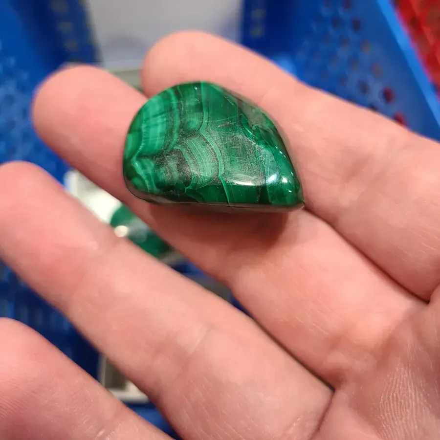
A green stone to a green dress sounds logical and often disappoints: two close shades cancel each other, and the piece is gone. The lightness gap saves it. Dark malachite on pale green linen reads well, pale chrysoprase on dark green velvet reads well too.
The danger zone is the middle, where the hue almost matches but not quite. The mind notices the near-miss and treats it as a mistake rather than a plan. So a tone-on-tone echo is taken either dead on, when it looks like a considered set, or with an obvious lightness gap, when it looks like a rhythm. The in-between is best avoided.
Contrast around the colour wheel
Opposite colours strengthen each other, and the second strategy is built on that. A blue stone on orange or ochre, red on green, yellow on violet give the loudest sound to be had.
The loudness wants dosing. Full contrast works best in a small size: earrings, a ring, a modest pendant. A large collar in the opposite colour to the dress reads as a costume, not as jewellery. Lightness softens contrast: mute one of the two colours, and the pair moves from an argument to a conversation.
The stone answers to cloth and skin at once
A stone hangs between two grounds: cloth behind it, skin around it. At the neck the skin is nearer, on the chest the cloth already is, on the hand they trade places with every movement. So the same stone in an earring and in a pendant looks different.
Hence a practical split: near the face check the stone against the skin, below the collarbone against the clothing. What passes between stone, metal, and the undertone of the skin is worked through in the guide to which metal suits your skin, and the two questions are best answered in turn. Our half of the task ends where the cloth begins.
Upload a photo of your pet, someone you love, or an object. We'll build a 3D model and hand-cast it in pewter.



Jewellery under a print
A print is a ready-made palette that someone has already assembled for you, and arguing with it does not pay.
Take one colour from the print and repeat it
The safest move with a patterned cloth takes five seconds. Find in the print a colour that appears rarely and in small patches, and repeat that one in the stone. Not the main ground, not the largest element, but a secondary note.
The ground already holds its area and needs no help. A rare colour gains support from the repeat, and the whole pattern begins to look assembled, as if the jewellery came with the cloth. The move works the same on a floral cotton, a geometric print, and an abstract one.
Small and large prints ask for different sizes
A small, busy pattern behaves like texture: from a little way off it blends into one tone. So the piece can be any size, but it should have a clean silhouette, or it will blur into the speckle.
A large print is already a set of patches, and adding one more is a risk. Here metal without colour wins: a smooth chain, a ring, earrings of a plain shape. A coloured stone is taken to a large pattern in only two cases: it repeats one of the design's colours exactly, or it is markedly darker and smaller than anything drawn on the cloth.
When the print is jewellery itself
Some cloth is honest not to add anything at the neck. A dense multicoloured pattern at the collar, embroidery along the neckline, a printed silk with a large design already hold the attention, and a collar on them becomes a spare line.
The way out is not to drop jewellery but to move it. Leave the neck, keep the hands and ears: a ring, a bracelet, spare earrings. The same move rescues scarves and shawls. How accents are shared out when several pieces are worn at once is worked through in the guide to combining several pieces of jewellery.
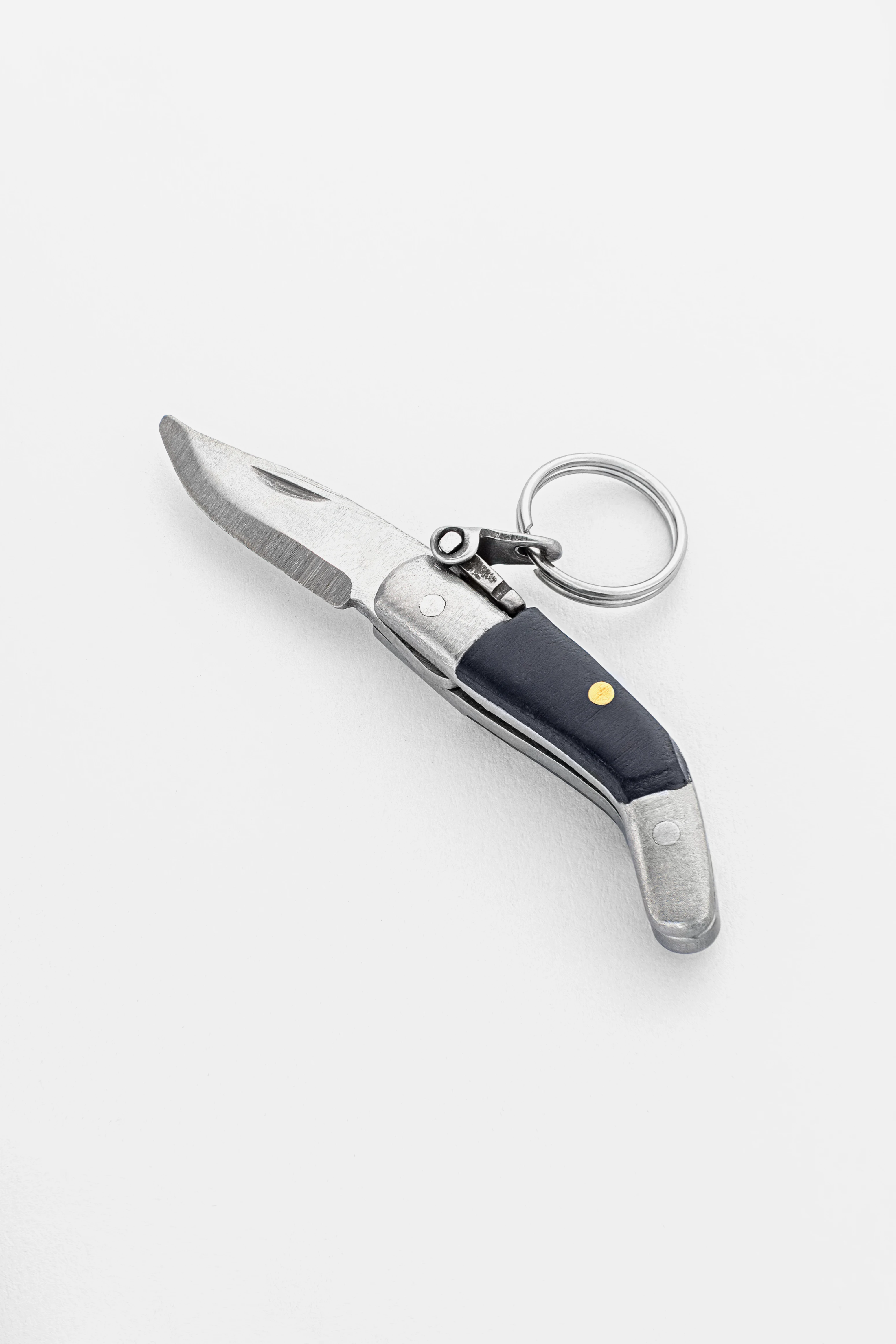
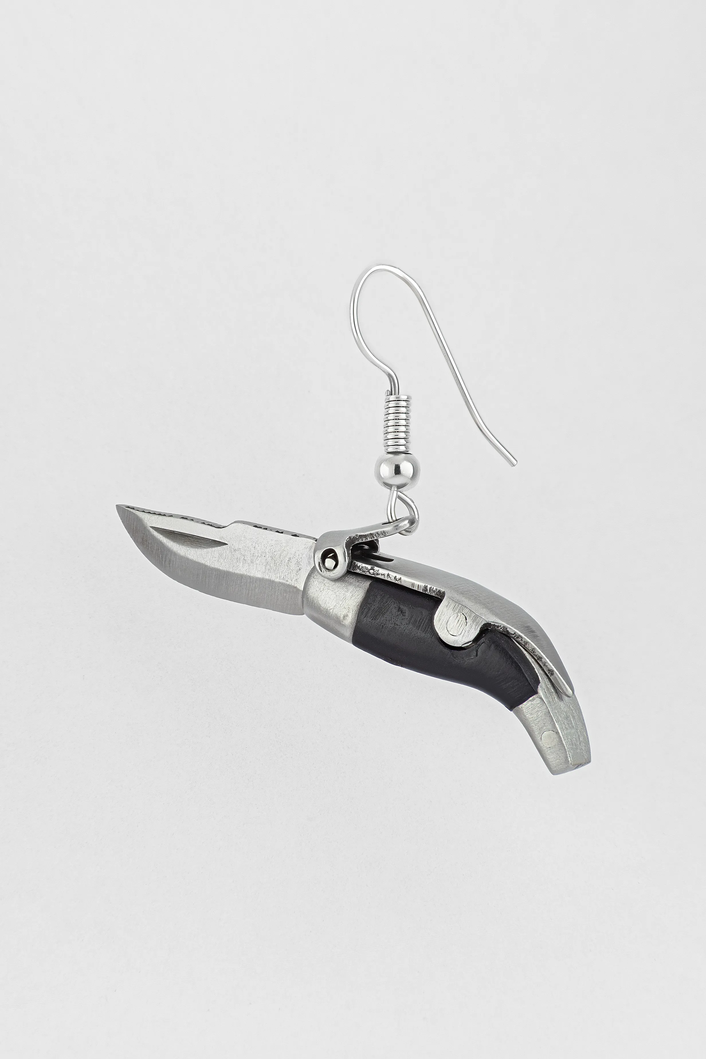
CAPAORA mini knife pendant
The 18th-century Spanish navaja in miniature: 40 mm of stainless steel, a real folding mechanism and a Palanquilla lock that clicks. An affordable gift to remember.
Authentic · Ships from Spain · 14-day returns
Colour repeated: the second and third point
A single spot of colour in a look is easily read as an accident. On that rests a device stylists use, and the device has clear limits.
The rule of the second point
This is a stylist's device, not a law of perception, and passing it off as the second would be dishonest. If you bring a colour into a look, show it at least twice and in different places. A green stone in the earrings plus a green detail in the scarf. Warm brass at the neck plus a warm belt buckle. A red string of beads plus a red lining in a cuff.
You can only test it on yourself, and the test costs nothing. Build a look with a single coloured spot, photograph it, then add a second point of the same colour and photograph it again. The difference between the two shots shows at once, and you make the call by them, not by someone else's rule.
Bag and shoe hardware is already metal on you
Metal turns up on a person well before the jewellery. A belt buckle, the zip and clasps of a bag, the eyelets and studs on shoes, the frame of glasses, the strap of a watch. All of it shines, returns light, and joins the picture on the same terms as a chain.
Bring that hardware into one temperature, and the jewellery falls into place by itself. The decision is made once: bags and shoes change less often than jewellery, so it makes sense to fit the piece to them. A belt with a light buckle and a watch on a steel bracelet have already set a white line, and a yellow chain in that company will be the one warm spot up top.
When the hardware fights the jewellery
The ordinary case: a favourite bag with gold trim and a favourite silver ring. Three moves, all honest. First, split by storeys: the metal of the bag and shoes lives low, the jewellery high, and in one frame they barely meet. Second, set a bridge piece where both tones appear, and the mixing reads as a decision. Third, give warm metal everything below and white everything above, holding the line strictly. How a deliberate mix of two metals is built is worked through in the guide to mixing silver and gold.
Why colour is counted by area, not by points
Past this the ground turns to taste, and there is no universal number. There is an observation from practitioners: the more places one colour occupies, the less attention is left for the piece meant as the accent. There is no numbered threshold, because it would depend on the size of the patches, not their count.
It is easier to count by area. Three small green details read more calmly than green earrings, a green bag, and green shoes: in the second case these are large patches, and the look starts to read as a uniform. Hence a working measure people use on shoots: one large point of colour plus one small, everything else neutral.
Jewellery under a coat
In the cold season half the look spends months hidden under a coat, and the jewellery has to be reassembled.
A coat covers the neck and frees the hands
Outerwear changes the whole stage. The neck is taken by a collar and a scarf, the chest is closed, but the hands, the wrists, and the ears stay in view. So attention moves there: rings over gloves or without them, a bracelet on the cuff, earrings that show from under a hat.
The colour now is set by the coat, not the shirt. Camel, tan, ginger, and brown pull towards yellow metal and amber, though on a pale camel a brooch or bracelet has to be taken larger, or a yellow piece meets the cloth in both warmth and lightness. Grey, black, and navy coats hold white metal and cool stones, and the same caveat covers light grey. A red or wine coat is a strong colour and wants a neutral metal with no stone, or the frame ends up with two lead roles.
A brooch puts jewellery back in view
A brooch solves the main winter problem: it works over the cloth rather than under it. A spot on the lapel, the collar, the shoulder seam, or the scarf is visible at all times, in any weather and under any number of layers.
By colour a brooch is tied either to the coat itself or to whatever shows from under it: a scarf, a lining, a jumper. Warm brass on camel wool gives a calm echo, cool geometry on navy gives a contrast. Where exactly to place it and how to pin it on a heavy cloth is worked through in the guide to wearing a brooch.
The scarf and collar decide a pendant's fate
A pendant under a scarf is invisible, and that has to be admitted before leaving the house. Three options. Wear it deliberately hidden, as a private thing for yourself. Bring it out over a polo neck and knitwear, choosing a length below the line of the scarf. Or swap it for the season to earrings and rings.
The third option is unfairly rare. In winter the face in the frame is framed by a collar and a hat, and the ears stay open, so earrings show better in winter than in summer. It makes sense to shift attention there and bring the chain back in spring with the open neck.
Leave your email, we'll send your discount code. No spam, unsubscribe anytime.
The code arrives by email, valid on your first order.
Changing the wardrobe by season
Twice a year the wardrobe turns over entirely, and the jewellery box stays put. Hence the feeling that the pieces have stopped suiting anything.
The winter palette asks for a different metal
Winter clothing is darker, denser, and deeper in colour: grey, black, navy, burgundy, emerald, heavy wool and cashmere. The ground turns darker, so contrast with the metal grows on its own, and jewellery can be taken quieter and smaller than in summer.
The temperature of the light changes too: short days, warm lamps, electric light switched on early. Under warm light yellow metal flares and white warms up. Hence the winter pull towards gold and amber: it has a physical cause, and mood comes second.
The summer wardrobe and a lighter shine
In summer the cloth lightens and thins: white linen, pale cotton, pastel, printed silk. The ground moves close to the metal in lightness, and a small piece begins to fade. So summer favours larger and simpler forms, and metal with a matt or hammered surface, which catches light differently from a polished one.
The second summer factor is a tan and open skin. The skin darkens, the gap with light metal grows, and silver on a tanned arm rings louder than in winter. On top of that many parts of the body are bare, so bracelets, rings on several fingers, and anklets get a stage they never have in winter.
Between seasons: how not to rebuild the box
Spring and autumn are a wardrobe of layers, where different cloths and colours live on a person at once. Here it helps not to match every garment but to hold one rule: tie the jewellery to the layer that stays on you indoors.
The coat comes off, the scarf goes away, but the jumper or shirt stays, and it is those that make the ground most of the day. So choose the metal for the middle layer, not the outer one. Then moving from the street indoors does not break the look, and there is no need to carry a second chain in the bag.
Light decides as much as cloth
The same pair of cloth and metal gives a different result in different light, and the cause is physical.
The warm lamp, the neutral office, the overcast street
Light has a temperature, measured in kelvin. An incandescent bulb gives about 2700 kelvin and floods everything with yellow, daylight is nearer 5500, and an overcast sky climbs higher up the scale, into the cool zone. Metal honestly reflects whatever falls on it.
The office is worth a word, because a misconception has grown here. The LEDs in workspaces are set more often in the 3000 to 4000 kelvin range, the warm and neutral part of the scale, not the cool one. The chill of an office comes less from the lamp than from grey surfaces and the absence of a daylight window nearby.
Two things follow. White metal wins in cool light and loses a little by candlelight, while yellow does the reverse. And it makes sense to try a piece in the light you will wear it in: a piece chosen under the warm lamp of a fitting room looks different on an overcast street, and the shop is not to blame.
Metamerism: matched at the counter, split on the street
The effect has a name. Metamerism is when two colours match under one source of light and part under another, because their spectra differ while the eye, under a given light, reads them the same.
That is how a stone matched in the shop to the colour of a dress turns a different shade at home. There was no error in the matching, the error was in the conditions. Hence a household rule that saves the nerves: check a pair of colours at a window in daylight, then again at home under the lamp the piece will live with. Two sources instead of one, and metamerism stops being a surprise.
Stones that change colour with the light
Some stones change not the shade but the colour itself as the light changes: alexandrite looks greenish in daylight and reddish-purple under an incandescent bulb. For a wardrobe one rule follows: a fixed pairing is not built for such a stone, because a piece chosen for its daytime look turns out, in the evening, chosen for a different stone. The place for such stones is a neutral ground, black, grey, navy. Then the change of colour reads as a story of its own and does not break an echo built with coloured cloth. How the alexandrite effect works inside the stone, and how it differs from asterism and iridescence, is worked through in the guide to optical effects in gemstones.
How colour echo changed with the wardrobe
The rules for combining colour did not float in the air, they grew out of which colours people could get in the first place.
While colour was expensive
For long centuries a bright, fast colour cost more than the cloth itself. Tyrian purple was drawn from sea snails of the murex family, and thousands of shells went into a scrap of dye, so purple meant status, not taste. Blue ultramarine was made from lapis lazuli, the very stone cut into jewellery, and drawing the colour out of it was a craft of its own: ground to powder the stone gives a greyish, ashen dust, and the clean blue was washed out with lye from a dough kneaded on wax, resins, and oil. The recipe was set down by Cennino Cennini at the turn of the fourteenth and fifteenth centuries, and it took not hours but days.
In such a world the question of combining was answered differently: colour in clothing was a rarity, and jewellery simply backed it up as a cheaper way of showing the same note. Glass beads to the shade of costly cloth, enamel in place of a stone, brass in place of gold. Colour echo began as thrift, not as taste.
Synthetic dyes made the wardrobe loud
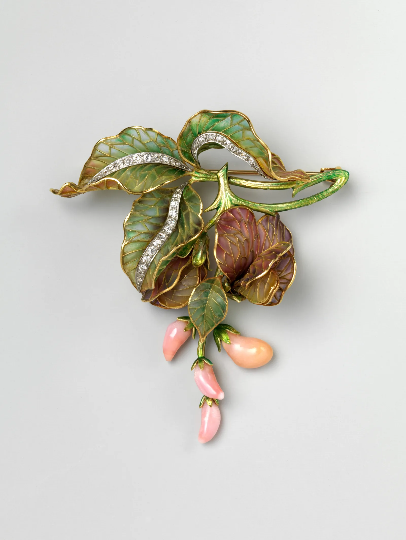
Everything changed in 1856. William Perkin, an eighteen-year-old student, was trying to synthesise quinine, got a dark sludge instead, and found that it dyed silk a vivid purple. So mauveine appeared, the first commercially successful synthetic dye, and behind it the whole aniline industry.
The consequences for jewellery were direct. Clothing gained colours that natural dyes had never held: a lurid magenta, a harsh green, a saturated lilac. Quiet natural stones began to lose beside such cloth, and bright enamels came into fashion, cut glass, contrasting inlays. The question of what to wear with this colour, in its present form, was born right then.
The twentieth century chose black and white metal
Black was worn before the twentieth century too, and far from only in mourning: it lived in court dress, in the clothing of the clergy, in men's evening wear. What was new in the 1920s was something else. The plain black dress settled as an everyday town garment for a broad public, and the universal dark ground lifted the question of the cloth's temperature off the wearer, and with it half the old rules of matching.
The metal was ready by then. Platinum had spread in jewellery earlier, in the first decade and a half of the century, when its strength allowed thin openwork settings. White gold appeared in the 1910s as a cheaper substitute for platinum and came into wide use in the 1920s. Art Deco geometry finished the job: on a dark ground the silhouette reads, so the jewellery of those years was built on clean form and contrast rather than richness of colour. Much of what looks today like a fixed rule took shape in exactly those years.
Jewellery that settles onto anything you wear
A selection of pieces with a clear metal colour and a calm shape: they hold on black, on white, and on denim, which also makes them the easy piece to give.
Send a friend a discount code, they save on their first order.
Mistakes a photograph exposes
A mirror forgives much, a camera forgives nothing: it flattens depth to a plane, and every match in colour comes into the open.
The metal that found no pair in the frame
A silver chain, gold earrings, and a brass buckle add up to three different temperatures on one person. In life they are spread across the body and barely noticed, while in a photograph they land in one plane and read as disorder.
The cure is a review before leaving. Gather with your eye every piece of metal on you, watch and glasses and hardware included, and look not at the count but at the repeats. The odd one out is the temperature that found no pair in the look: a metal that turned up once and nowhere else reads as an accident in a shot. Number has nothing to do with it. It is simpler to take that one piece off, or give it a partner lower down, than to explain the shot afterwards.
The piece that matched the print and vanished
The second common trouble: a coloured piece on a busy cloth. In life the eye separates planes by depth and movement, while the camera folds them into one layer, and the pendant merges with the pattern of the dress.
The check takes a second: photograph yourself full length and see whether the jewellery reads in the shot. If it does not stand out at once, the rescue is either a swap to metal without colour, or a jump in size, or a shift of the accent to the ears, where the ground is skin and hair, not cloth.
The colour that argued with the face
The third mistake is subtler. A stone of a saturated cool colour right by the face pulls all the colour to itself, and the skin beside it reads greyish. It shows most with turquoise, bright blue, and lilac in large earrings under an overhead light.
The move is simple: drop that same stone lower, into a pendant, and set metal or a soft-toned stone at the face. The rule is old and universal: near the face belongs whatever adds light to the skin, and anything that competes with the face for brightness goes to the chest, the wrist, or the fingers. How the setting and the occasion shift this balance is worked through in the guide to jewellery and dress code.
Colour facts that surprise
- The word denim is traced to the French serge de Nîmes, cloth from the town of Nîmes, and the word jeans to a Genoese fustian: the French called it bleu de Gênes, the blue of Genoa.
- Red carmine was drawn from cochineal, insects living on the prickly pear cactus, and tens of thousands of dried creatures went into a pound of dye. The Spanish crown kept the trade secret and forbade the export of live insects from the colonies.
- Newton, in his Opticks of 1704, wound the spectrum into a ring and split it into seven unequal parts, sized to musical intervals. He found a mixture of colours by the centre of gravity of the figure, and the familiar pairs such as red with green came later, from a different, artistic tradition.
- Goethe published his Theory of Colours in 1810 and argued with Newton's optics, insisting that colour is born in the meeting of light and eye, not in the ray alone.
- In 1868 chemists synthesised alizarin, the dyeing matter of madder, and an ancient trade collapsed within a few years: madder fields in France and the Netherlands all but vanished.
- Green cloth and artificial flowers of the nineteenth century were dyed with arsenic compounds, and it cost the health of the women who worked with them.
- A white shirt looks whiter than white because of optical brighteners: they absorb ultraviolet and throw it back as a blue glow, which is why such cloth drifts to the cool side.
- In the first and strictest stage of Victorian mourning only matt black jewellery without shine was allowed, and so jet became the chief material of the era.
Frequently asked questions
What metal should I wear with black?
Any of them, because black owns no temperature and gives the widest contrast. White metal on black draws the silhouette and looks stricter, yellow glows and gains weight, so it is taken smaller in size. More than on any other ground, the difference between a polished and a matt surface shows here: polish catches a highlight and traces the outline, a matt finish gives an even, quiet patch.
Can I wear silver with beige or cream?
You can, and the question is settled not by temperature but by the lightness gap. On coffee, dark sand, and tobacco, silver reads beautifully and steps out as a cool note besides, working as an accent. On pale cream it all but vanishes, but yellow gold vanishes there just the same: the ground is light, the metal is light, no gap is left to catch. Volume rescues it, polish, and a dark stone, and a cool detail nearby too, a grey shirt under a beige jacket already gives silver something to hold to.
Should my jewellery match my bag hardware?
It helps, and it is noticed last. A belt buckle, the zip of a bag, the trim of a boot is metal already on the person, only below eye level. Bring that hardware into one temperature and the jewellery falls into place. Since bags and shoes change less often than jewellery, it is easier to fit the piece to them than the reverse.
What jewellery goes with a printed dress?
The first decision is place, not colour. If the pattern runs thick across the collar and shoulders, the neck is taken, and the jewellery moves to the ears and hands: earrings of a plain shape, a bracelet, a ring. If the pattern starts below the collarbone, a pendant stays possible, and then it is chosen by the rule from the print section, where both the design's colour and its scale are worked through. The one thing not to add to a patterned cloth is a second large coloured stone: two loud knots in one frame read as an argument, not a plan.
How do I match a stone to the colour of an outfit?
Two honest paths. Tone on tone with a compulsory lightness gap: a dark stone on light cloth or the reverse. Or a contrast by the opposite colour, but in a small size, or the piece starts to compete with the clothing. A near miss in hue, close but not exact, looks worse than either.
Gold or silver with jeans?
Denim already carries its own warm metal in the rivets and buttons, so yellow gold and brass sit on it naturally. Silver works too, above all on dark heavy denim, where the contrast runs higher. On faded light denim a small silver piece is lost, and larger forms serve better there.
What if there is no colour in my clothes at all?
Black, grey, and navy set no temperature, so the decision shifts from colour to form and surface. Take a piece with a clear outline and play with finish: matt beside polished, hammered beside smooth, a wide link beside a thin line. A coloured stone in such a wardrobe becomes a deliberate exception rather than a required element. One caveat covers white, which such a wardrobe tends to hold as well: a white shirt does set a temperature, cool or warm, and it is handled apart, by the white shirt section.
What do I do with a pendant in winter when the scarf hides it?
Three ways out: wear a long pendant over a polo neck and knitwear, move the accent to earrings and rings, which show better in winter, or keep the pendant as a private piece under the clothes. A brooch is a separate help: it works over a coat and shows under any number of layers.
Buying it as a gift? Each one arrives ready to give.
 A branded Zevira box and a little card come with every order.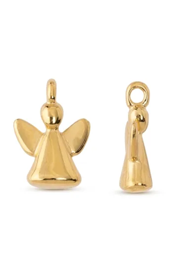
What is left once the rules are learned
The whole subject comes down to three questions, and their order is fixed. First: is there a lightness gap between the cloth and the piece, that is, will it be seen at all. Second: does the temperature of the metal match the temperature of the cloth, that is, will the piece read as a continuation of the clothing or as a separate voice. Third: does the colour turn up in the look a second time. The first question decides the fate of the piece, the second only its part, and it is not worth confusing them: out of that confusion grow the false bans like silver does not go with beige, which do not in fact exist.
The rules do not replace the eye, though. Chevreul began by refusing to trust the complaints about the dye and looking at the cloth for himself, and that is the best method there is: look for yourself and decide by what you see, not by what a rule says. A calm wardrobe of a few dependable pieces covers a year with no reassembly, and a piece that settles well onto black, onto white, and onto denim earns its keep more often than any narrow purchase. How this way of holding to things looks across a whole wardrobe is worked through in the guide to quiet luxury in jewellery.
About Zevira
Zevira gathers jewellery with a clear shape and an honest metal colour: pieces you can see on dark cloth, that do not drop out on light, and that ask for no separate wardrobe of their own. The symbols and the metalworking heritage of the Spanish interior are in them; the awkward rules for wearing them are not.